CASE STUDY

iHerb

Seven years designing e-commerce experiences, reusable UI and campaigns for a global health and wellness store.
Role Visual Designer II
Timeline April 2019—May 2026
Company iHerb
Team Product · Engineering · Marketing · Analytics · Creative

THE PROBLEM

Keep a fast-moving global store consistent across hundreds of products, campaigns, devices and 46+ languages.

WHAT I OWNED

UI and visual design for homepage, product and landing pages, reusable components and product cards, and campaign and brand design.

THE OUTCOME

A modular Bento homepage that became the standard layout for two years, plus reusable UI patterns, landing pages and campaigns for 16M+ customers.

01 — CONTEXT

Designing Scalable Digital Commerce Experiences

iHerb is a global health and wellness store serving 16M+ customers in 180+ countries.

Over seven years as a Visual Designer, I designed homepage, product and landing page experiences, reusable UI components, and campaigns across web, email and partner sites, working with Product, Engineering, Marketing, Analytics and Creative teams.
02 — CHALLENGE

Consistency at Global Scale

Many teams, constant campaigns and a worldwide audience, all on one storefront.

01 — Constant Campaigns

New promotions launched weekly, competing for the same homepage space.

02 — Many Products, One Look

Thousands of products and brands had to be easy to compare at a glance.

03 — 46+ Languages

Layouts had to hold up when text grew longer or changed direction in translation.

04 — Many Teams

Product, Marketing and Creative all needed patterns they could reuse without a designer starting from scratch.

03 — APPROACH

From Requirements to Reusable Patterns

I designed structure first, then turned what worked into patterns other teams could reuse.

01 — Structure

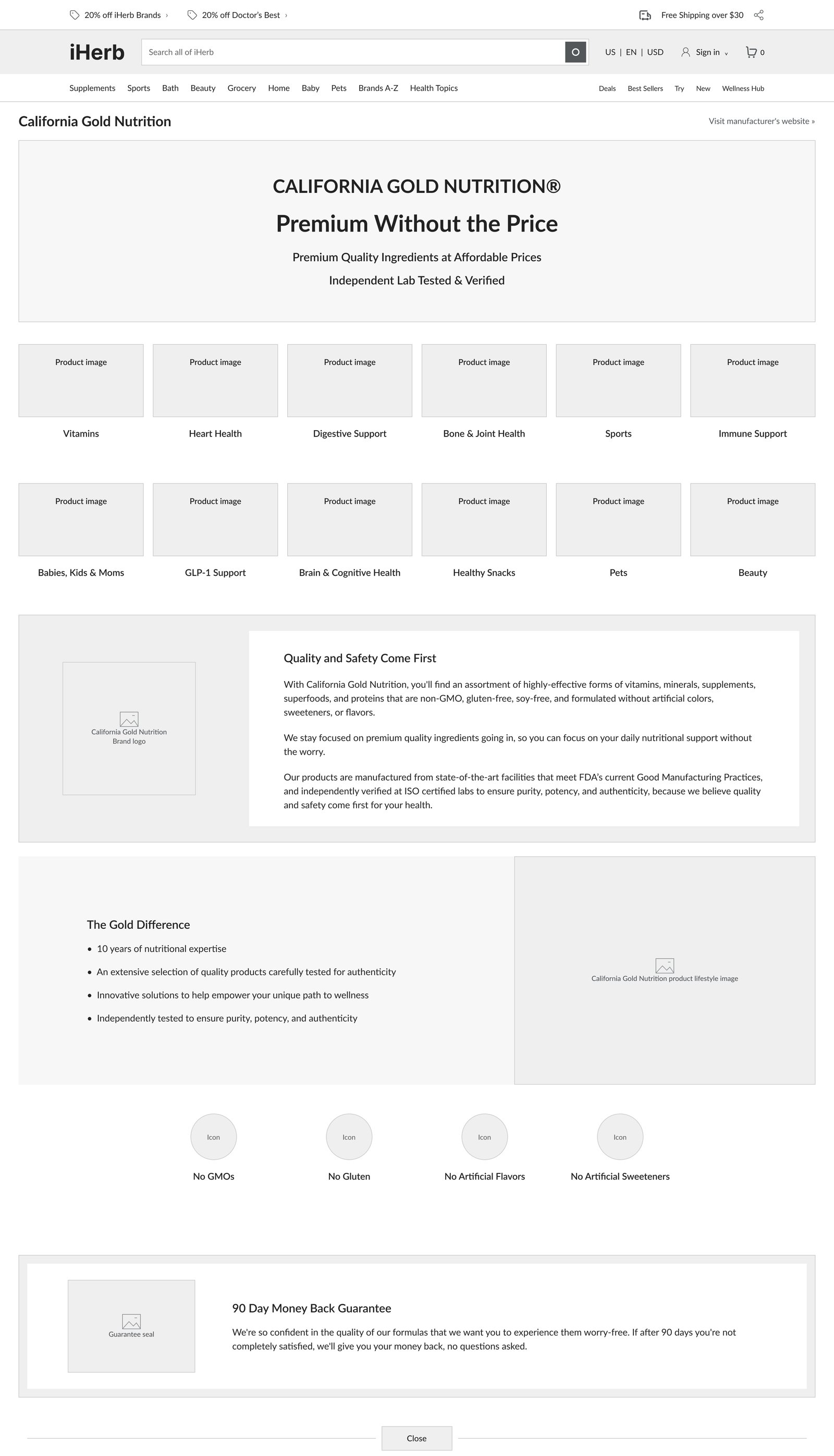
Wireframes to set hierarchy, content order and CTAs.

02 — Design

High-fidelity UI using iHerb’s type, color and components.

03 — Adapt

Desktop, tablet and mobile versions for every key page.

04 — Reuse

Turned successful layouts into components and guidelines.

04 — DESIGN SYSTEM

A Shared Foundation for Commerce

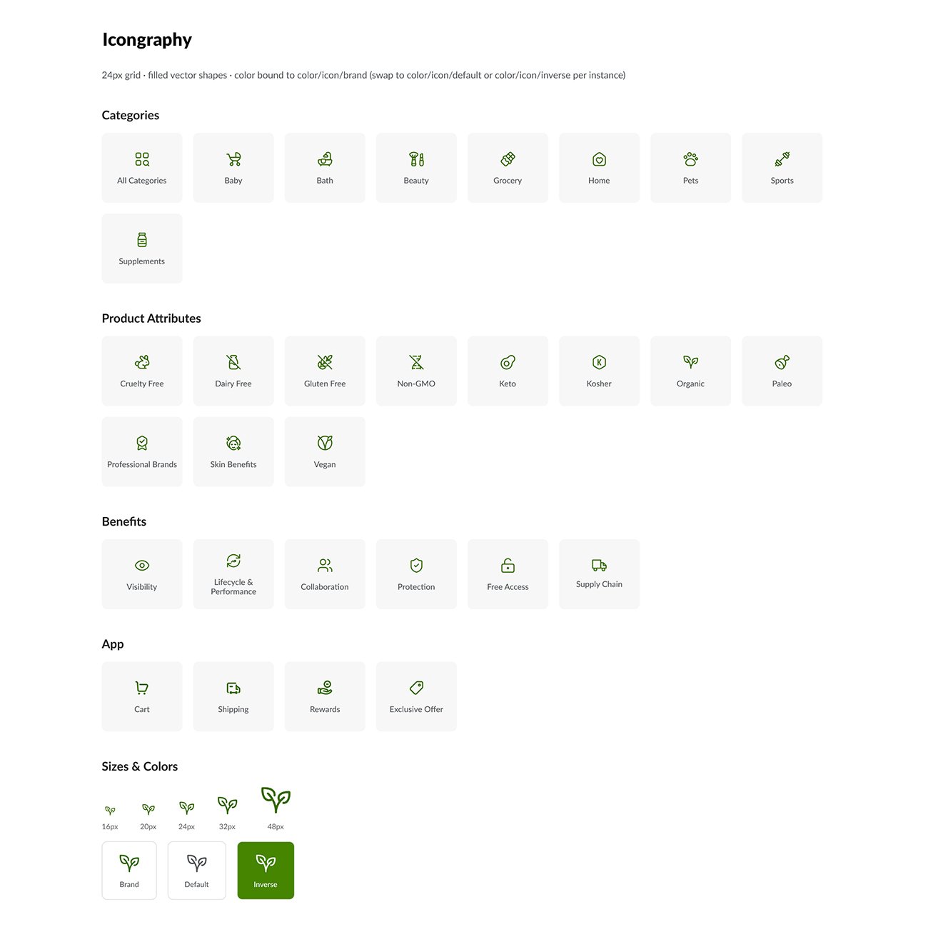
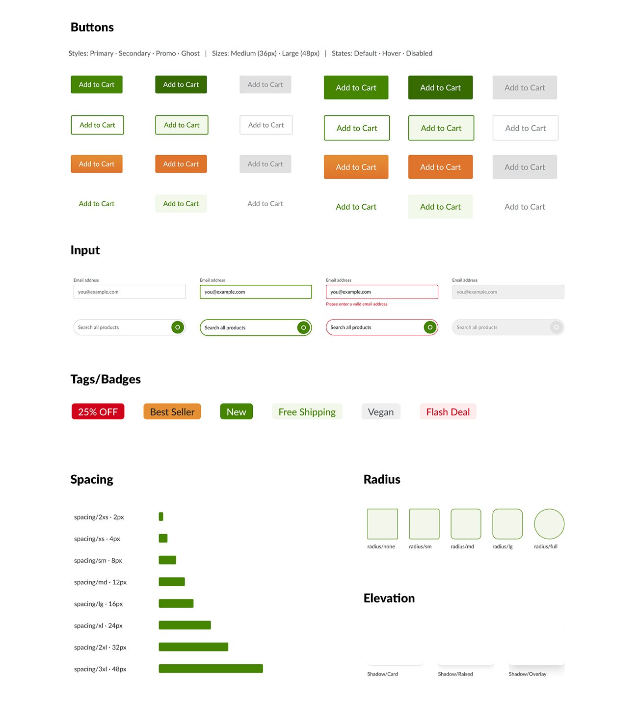
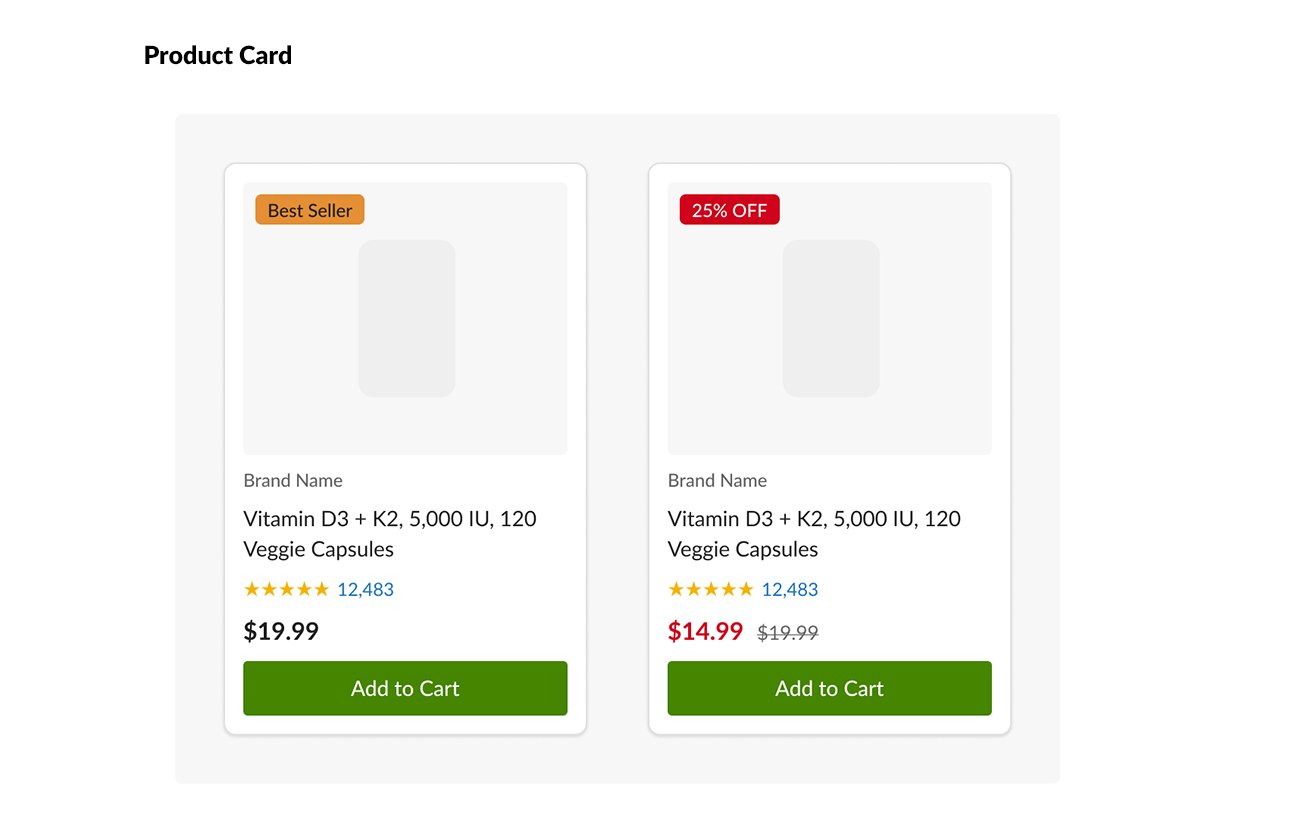
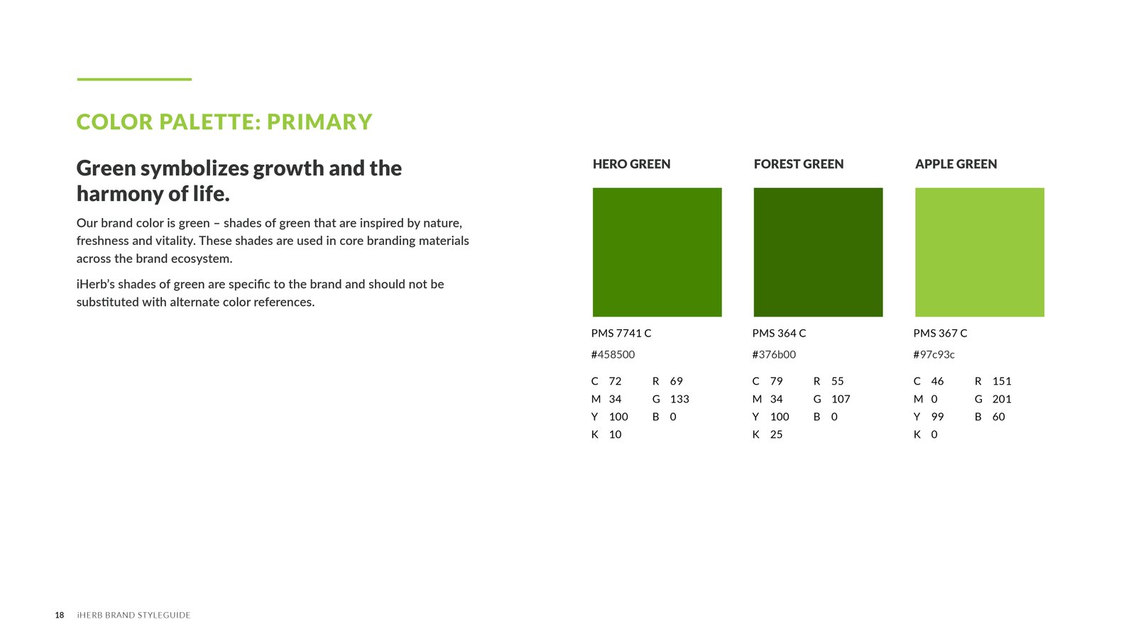
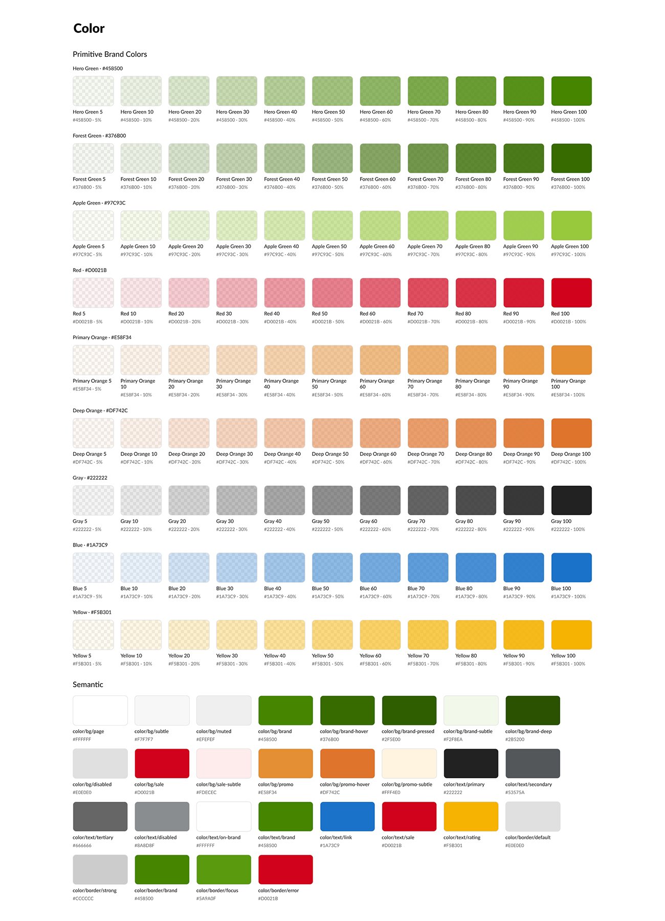
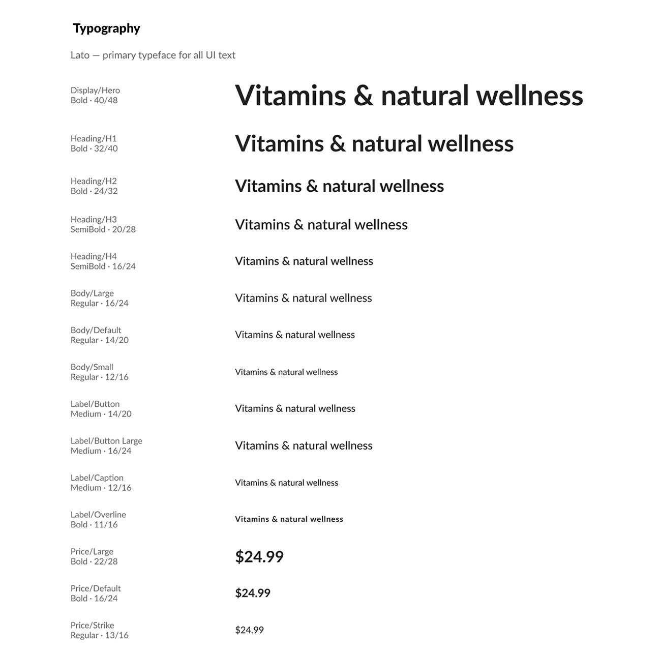
I designed iHerb’s UI system: color, typography, icons, components and product cards, giving every team the same building blocks.

Color

Brand colors mapped to interface states.

Typography

Heading, body and label styles for every screen size.

Iconography

30 icons for navigation and product categories.

UI Components

Buttons, forms, badges and promo modules with defined states.

Product Cards

One layout for image, name, rating, price and promotion.

05 — FEATURED: HOMEPAGE BENTO REDESIGN

Rethinking the Homepage Carousel

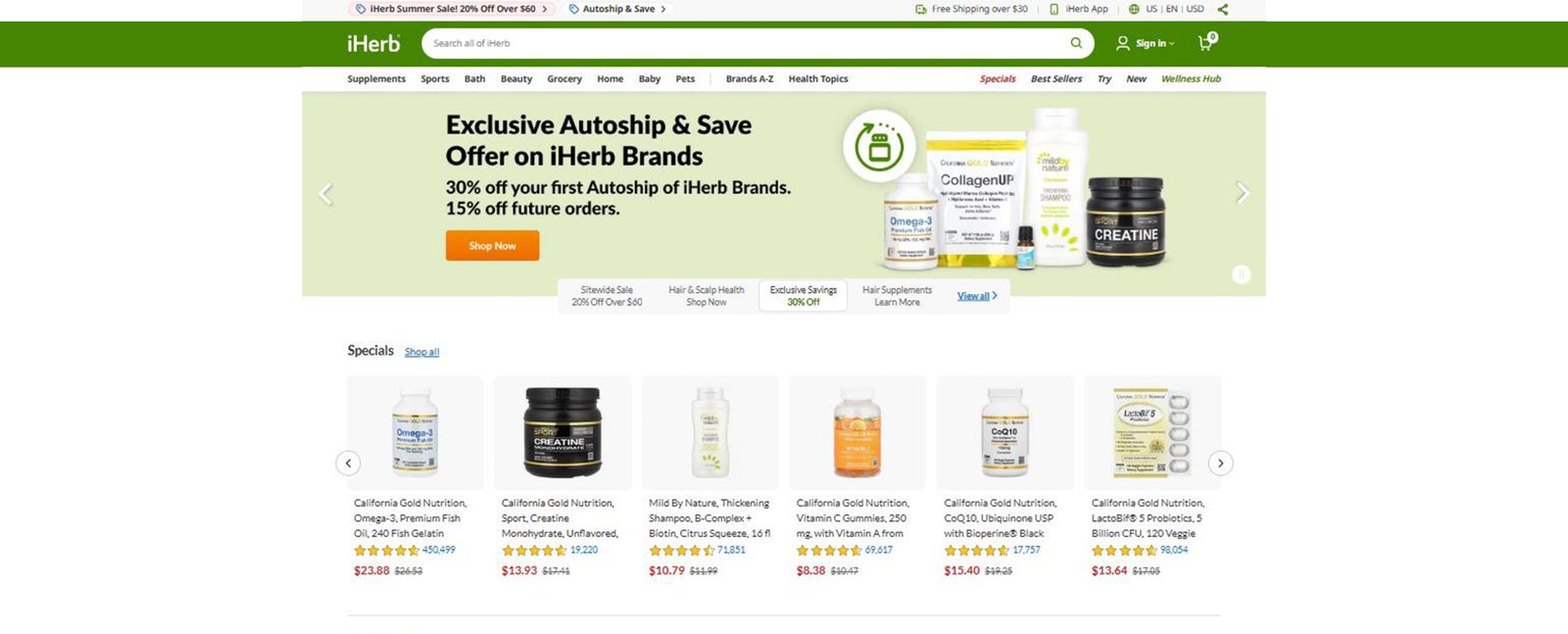
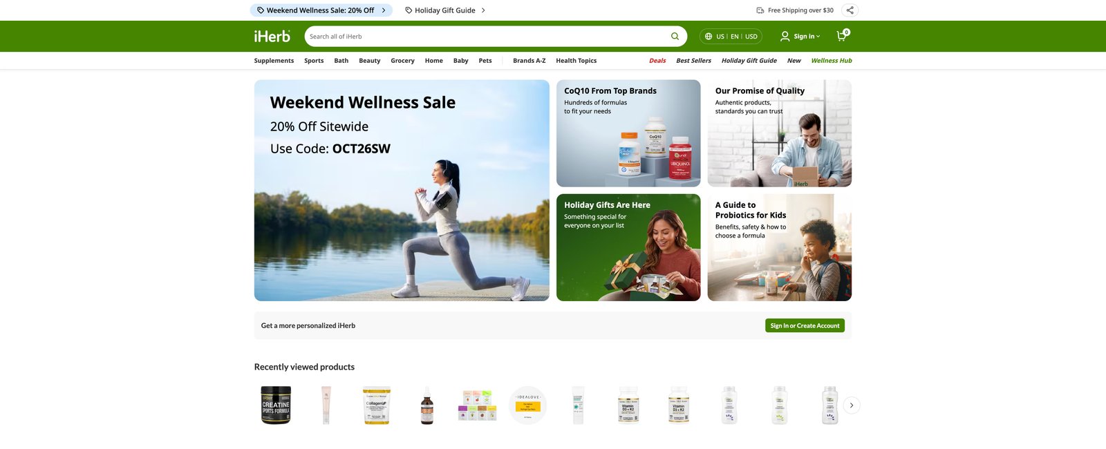
The homepage relied on a full-width rotating carousel, so most campaigns were hidden behind slides that few shoppers clicked through.

KEY DECISION

Show Everything. Keep One Focus.

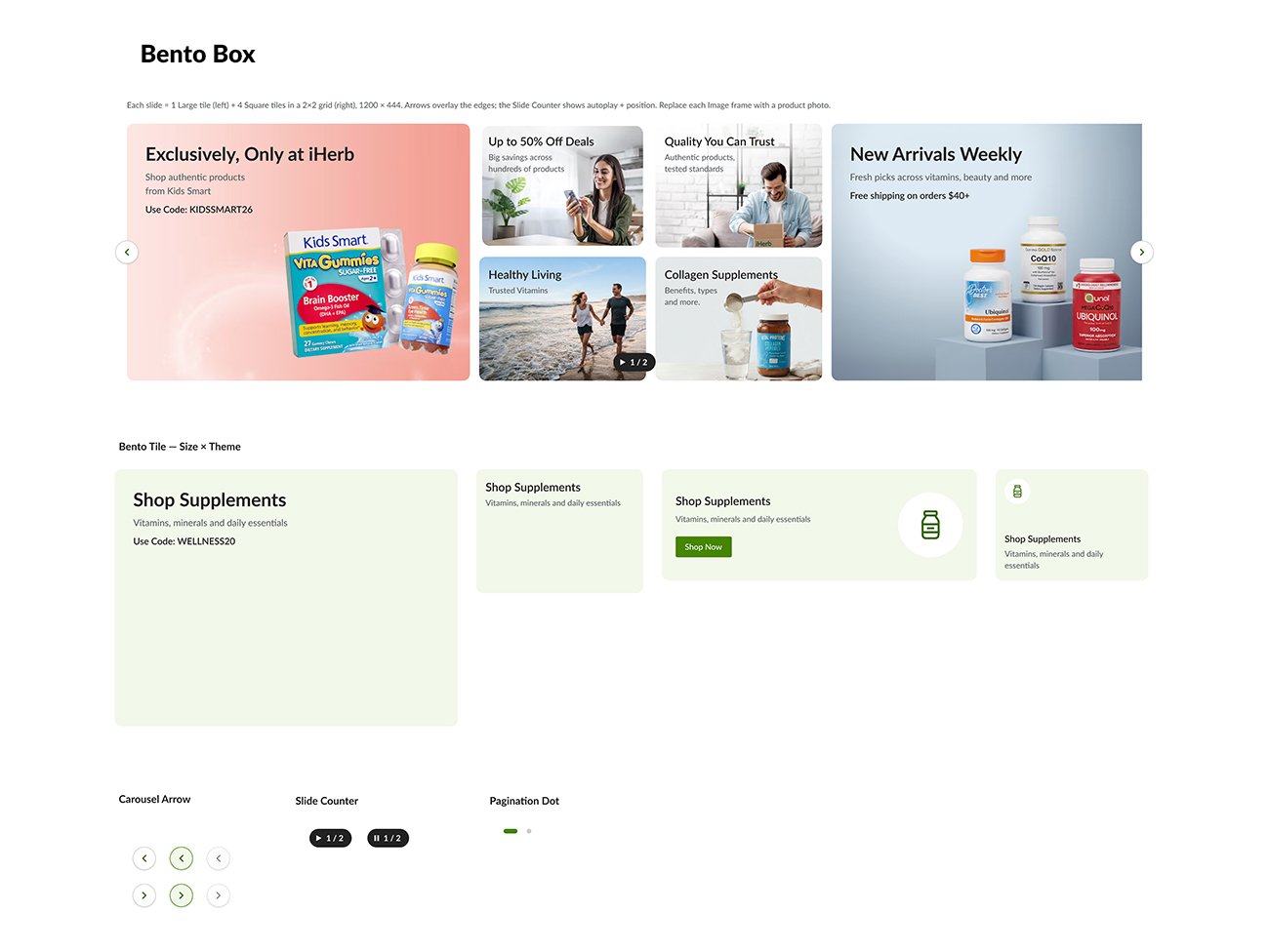
I replaced the carousel with a fixed Bento grid, so every campaign was visible at once, with one large primary tile to keep a clear focal point.

RESULT

Became the standard homepage layout for 2 years.

Old Home Carousel

New Home Carousel

06 — COMMERCE & LANDING PAGES

Pages Built for a Purpose

Three pages, each solving a different problem, from brand shopping to supplier onboarding.

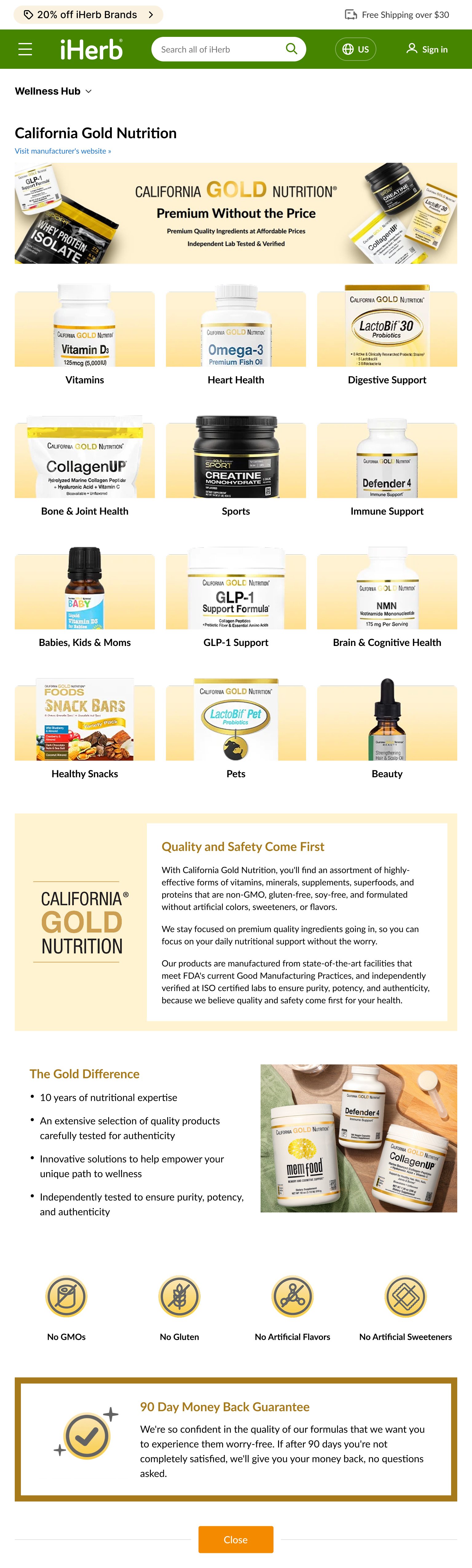
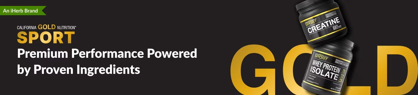
EXPERIENCE 01 — CALIFORNIA GOLD NUTRITION

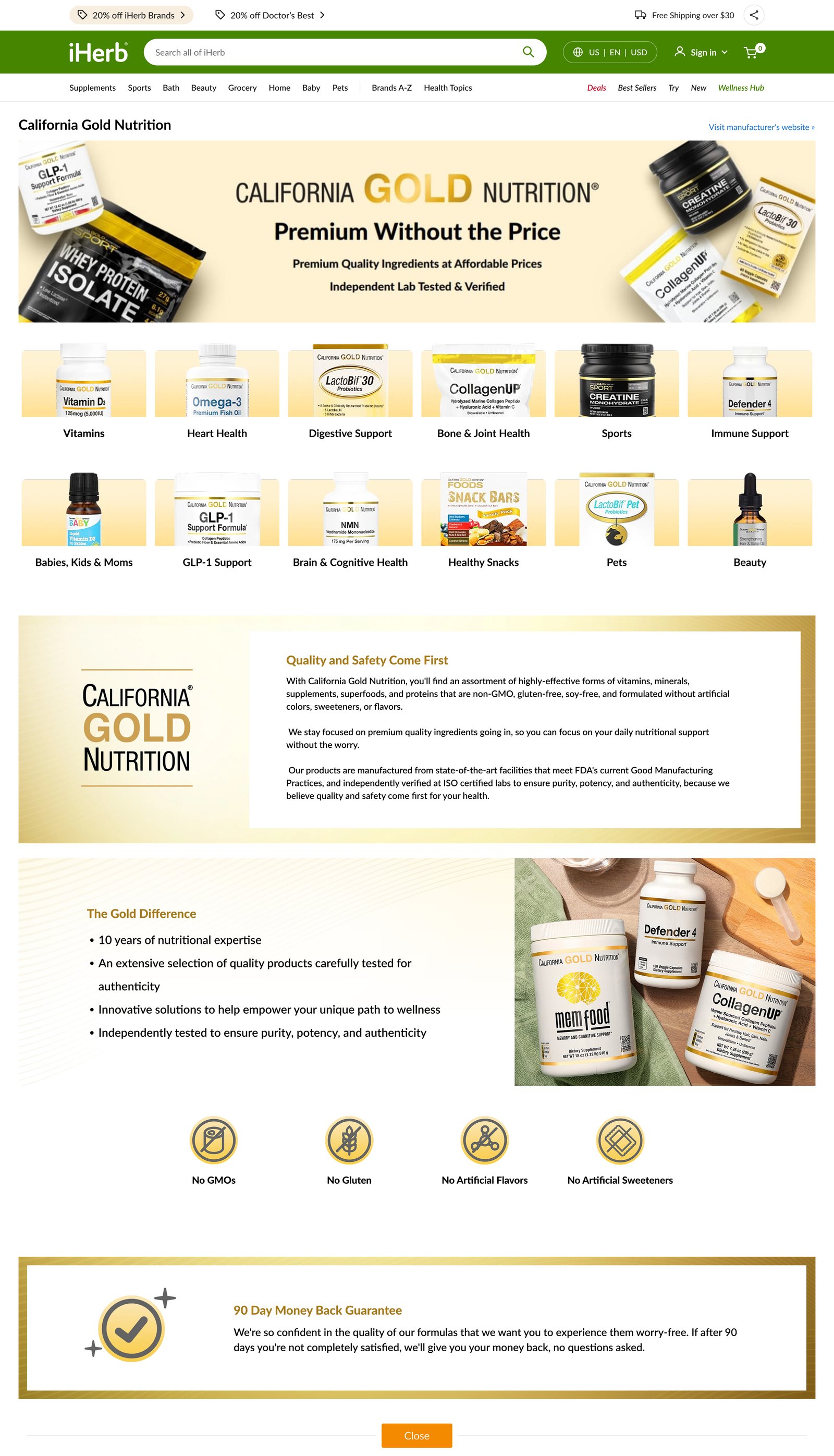
Brand Storytelling That Leads to Shopping

Brand pages for iHerb’s exclusive brand, from wireframe to desktop, tablet and mobile.

KEY DECISION

Story First. Shopping Right After.

I placed category navigation directly under the hero, so brand storytelling led straight into shopping.

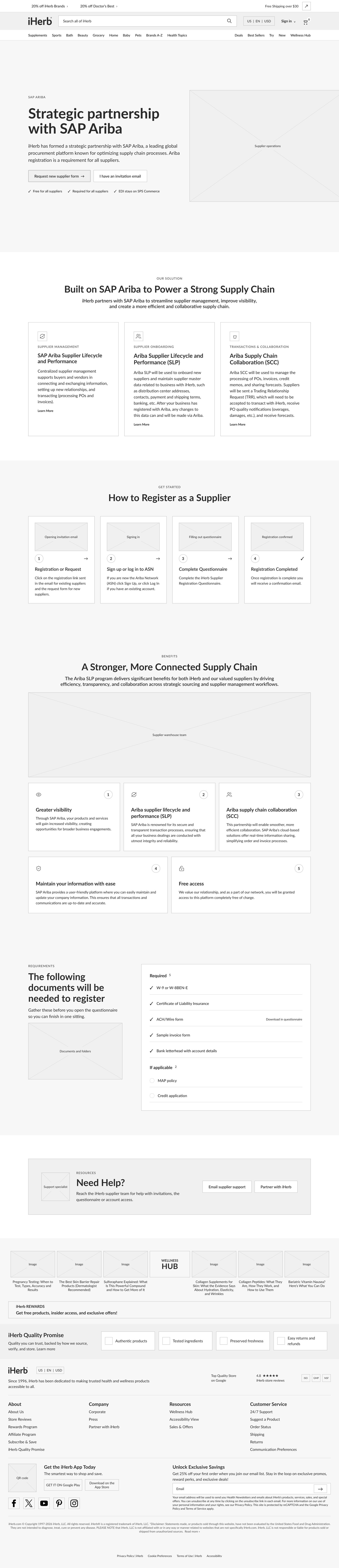
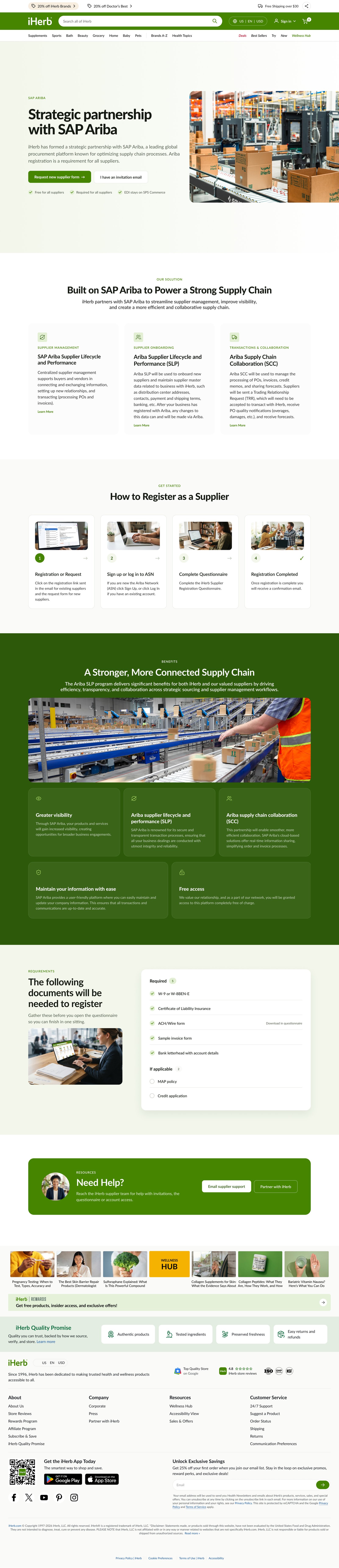
EXPERIENCE 02 — SAP ARIBA ONBOARDING

Making Supplier Onboarding Approachable

A landing page that guides suppliers through registering on SAP Ariba.

KEY DECISION

One Step at a Time. One Clear Action.

I broke the process into numbered steps with one clear next action each, instead of one long page of instructions.

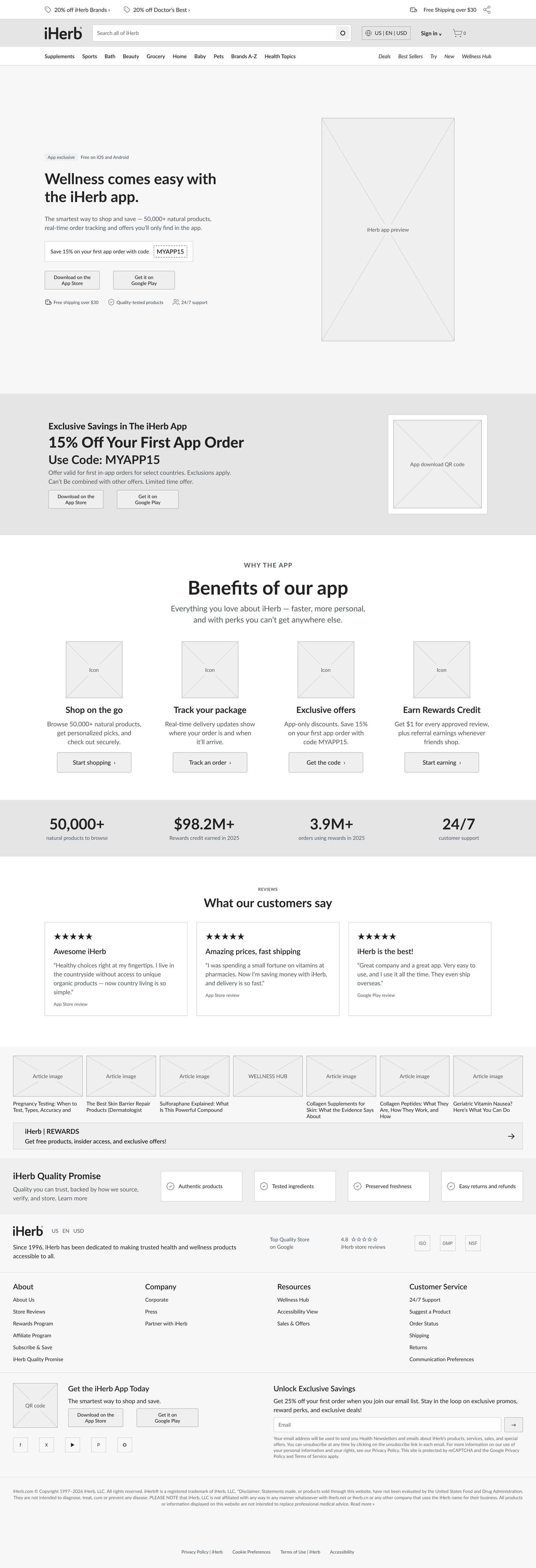
EXPERIENCE 03 — IHERB APP

Showing the App, Not Describing It

A landing page promoting the iHerb mobile app.

KEY DECISION

Show the App. Make Downloading Easy.

I paired each feature with a real app screen and repeated the download button after every section.

07 — CAMPAIGNS & BRAND

Campaigns Across Every Channel

Campaign and brand work across web, email and partner sites.

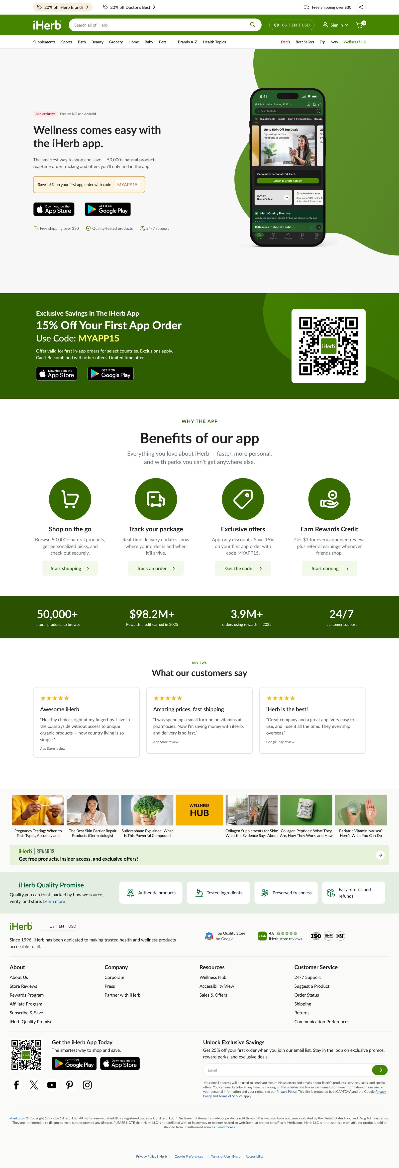
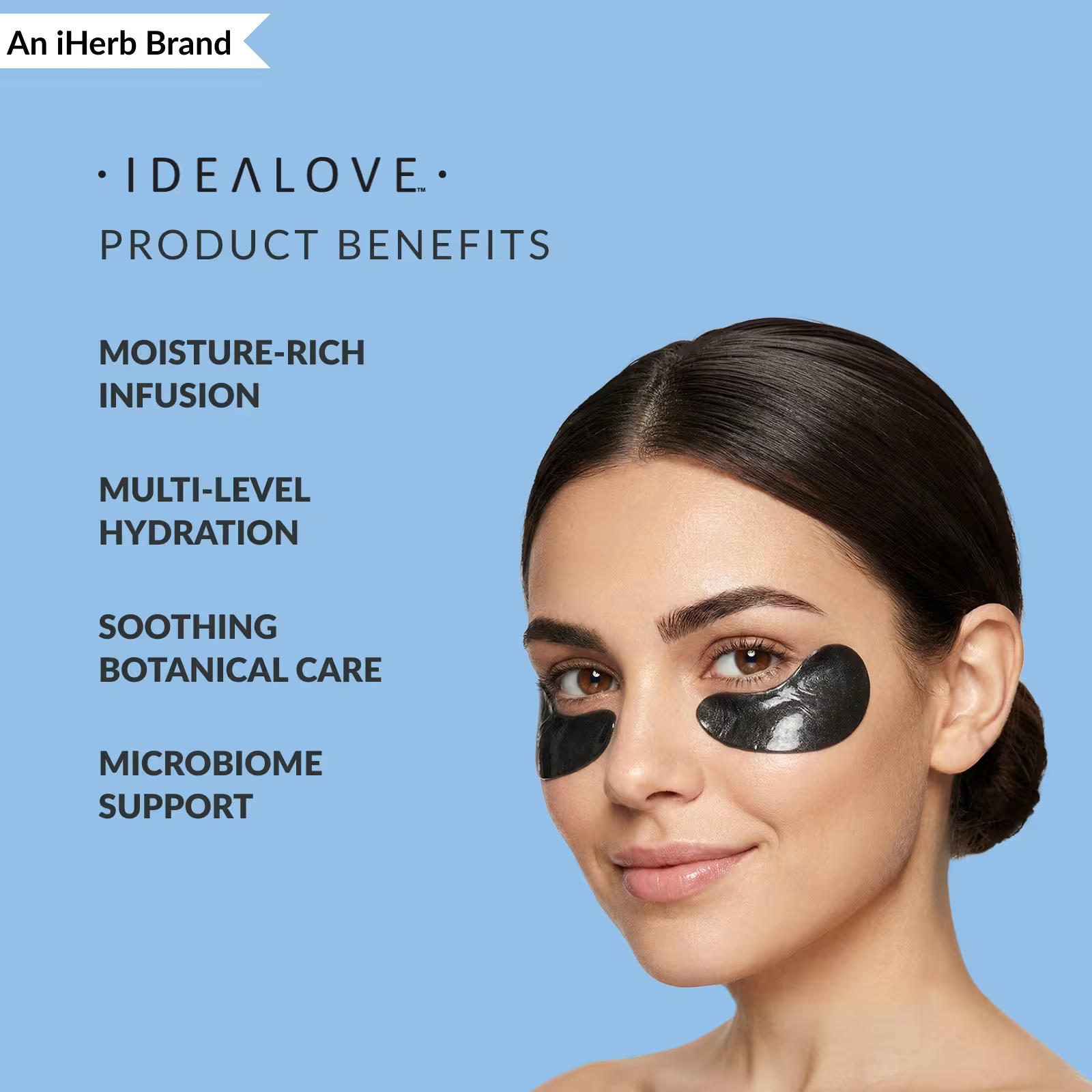
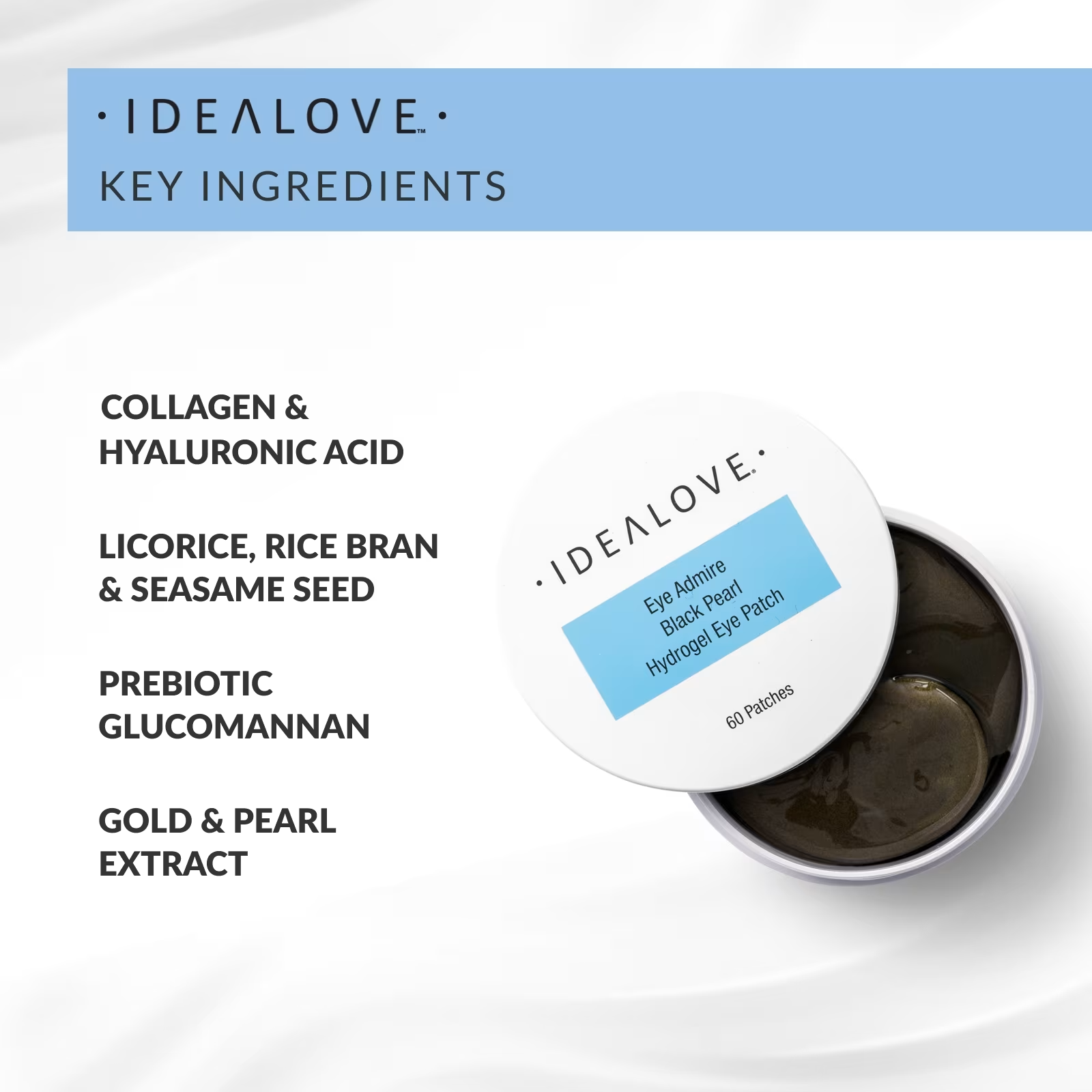
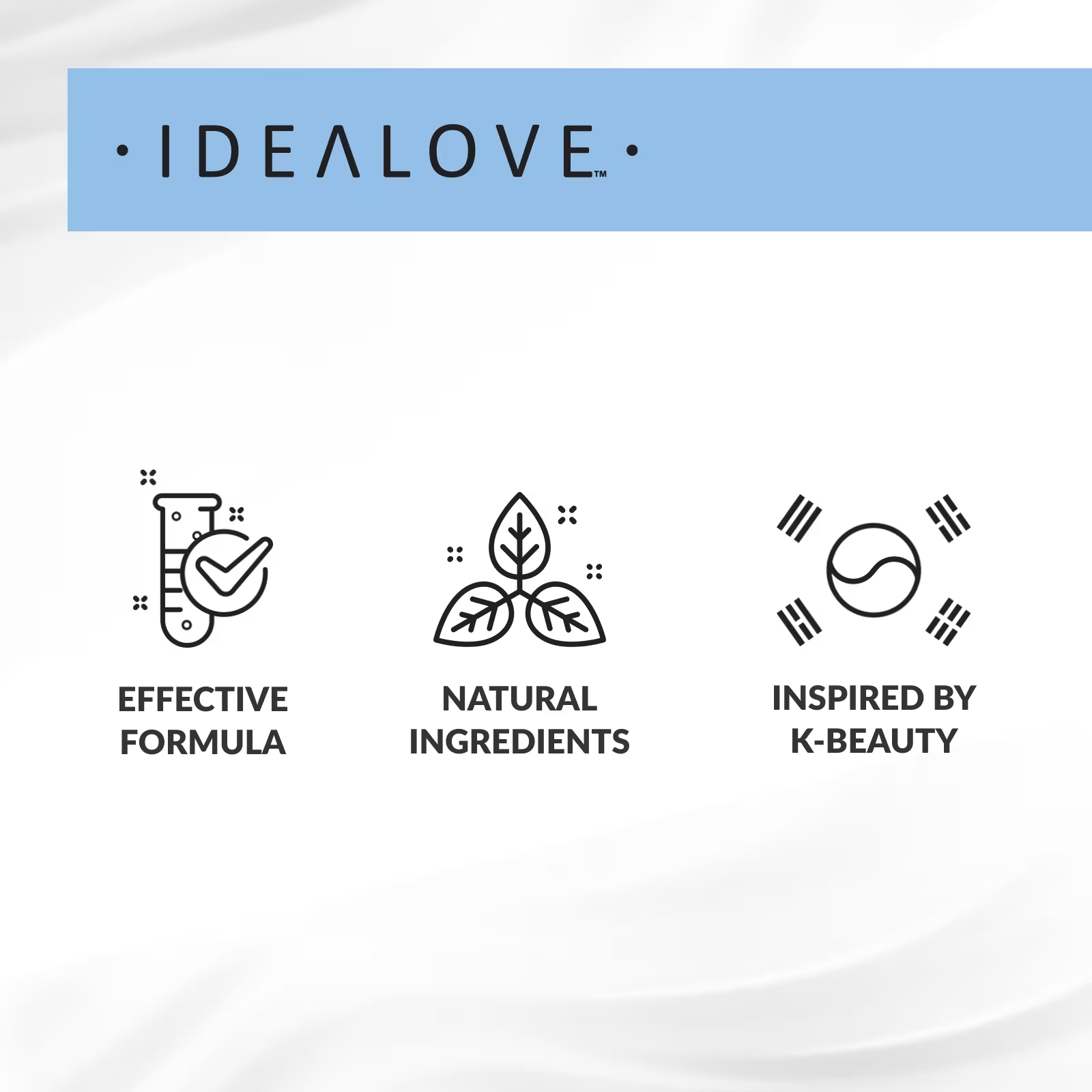
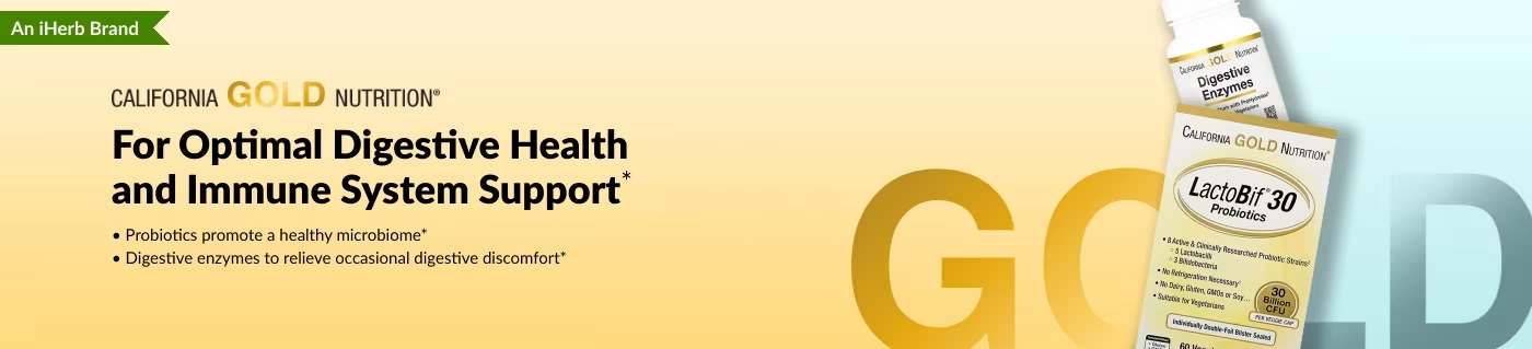
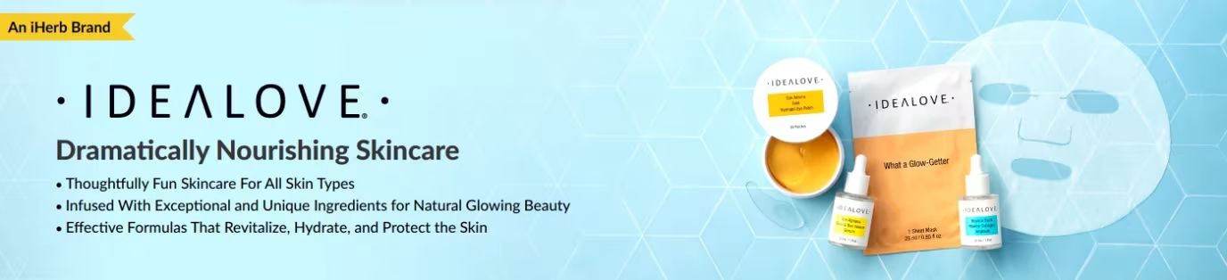
PDP Graphics · Benefit and ingredient graphics for product pages.

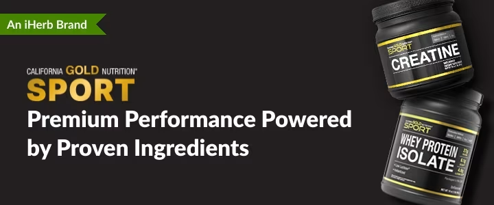
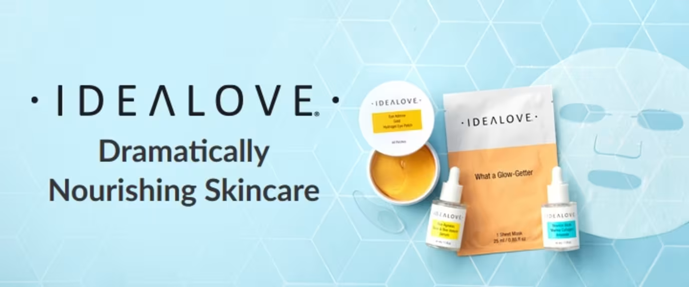
Promotional Banners · Seasonal and launch banners for every placement.

AutoShip & Save Emails · Email series promoting subscription savings.

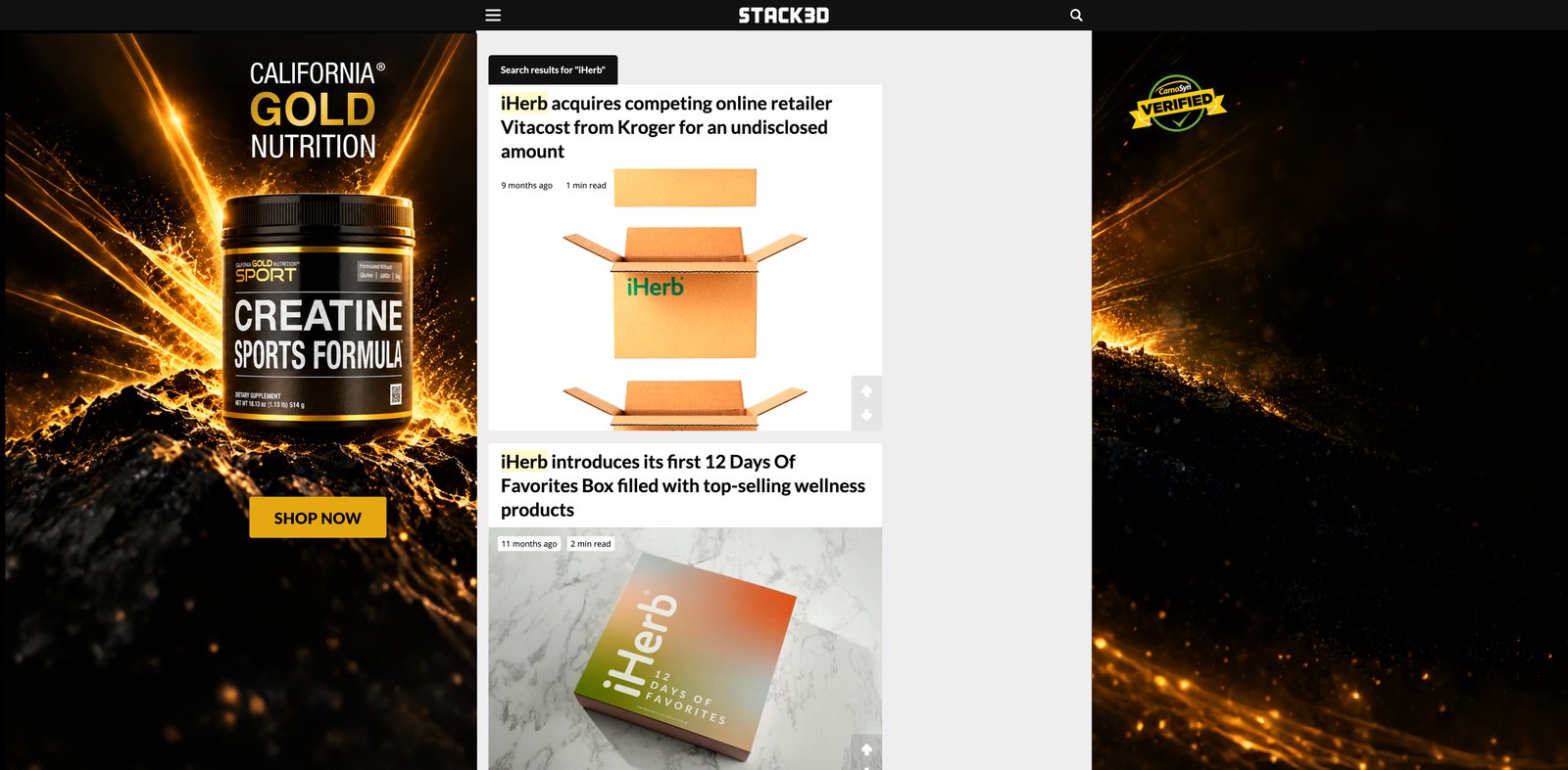
CGN × STACK3D Siteskin · Brand siteskin for a partner website.

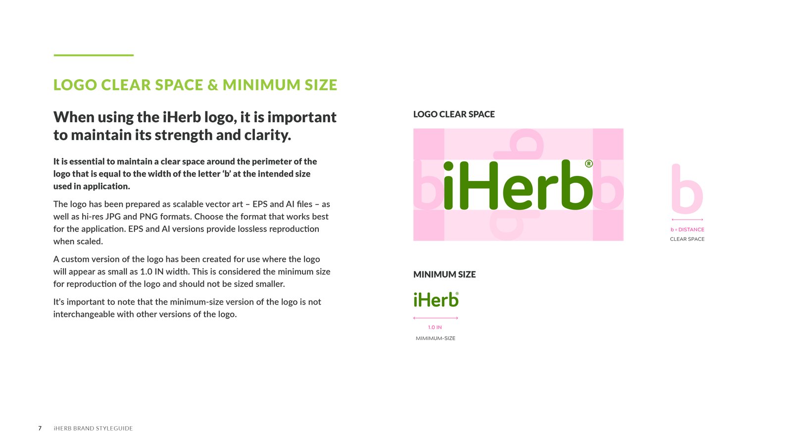
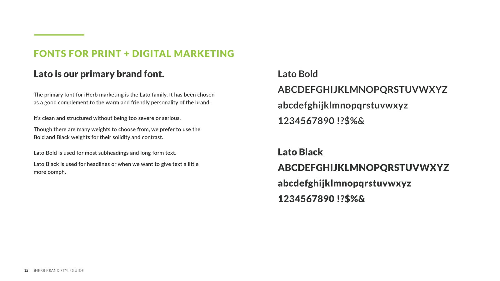
Brand Guidelines · Logo, type, color and imagery standards for all teams.

08 — SCALE & DELIVERY

Seven Years at Global Scale

Reusable UI, key pages and campaigns for a store serving 16M+ customers in 180+ countries.

2 Years as Standard

The Bento homepage layout, from launch to replacement.

7 Years

Homepage, product, landing page and campaign design, 2019–2026.

30 Icons

Navigation and product category icons for the UI system.

46+ Languages

Layouts designed to hold up in translation.

09 — REFLECTION

Key Learnings

What seven years of global commerce taught me.

Design for the Whole System

A single page change ripples across products, regions and campaigns.

Patterns Beat One-Offs

Turning good layouts into components saved time for every team after me.

Design for Translation

Layouts that work in English aren’t finished until they work in every language.

What I’d Do Next

Test the Bento homepage against the carousel with real shoppers, to measure which layout drove more discovery.

© 2026 Serj Khorozian — Made with ♥ in California.