CASE STUDY
Audio Digest
THE PROBLEM
WHAT I OWNED
THE OUTCOME
One system supporting 4,000+ catalog items across 14+ specialties, launched as 90% of customers moved from CDs to digital access.
01 — CONTEXT
Audio Digest
About the platform
- $22M annual revenue
- 1M+ CME credits a year
- 80% of users are members
02 — CHALLENGE
Complexity at Scale
01 — Thousands of Items
02 — Many Specialties
03 — Membership Clarity
04 — Built to Be Managed
03 — APPROACH
From Structure to System
01 — Wireframe
02 — Systemize
03 — Build in Sitecore
04 — Work With the Framework
04 — PROCESS
Defining the Experience Through UX Wireframes
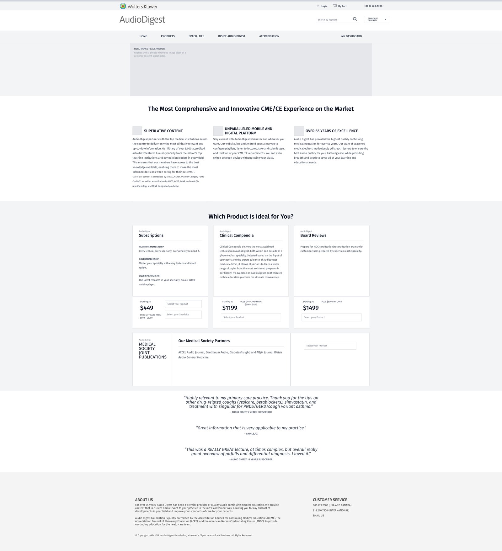
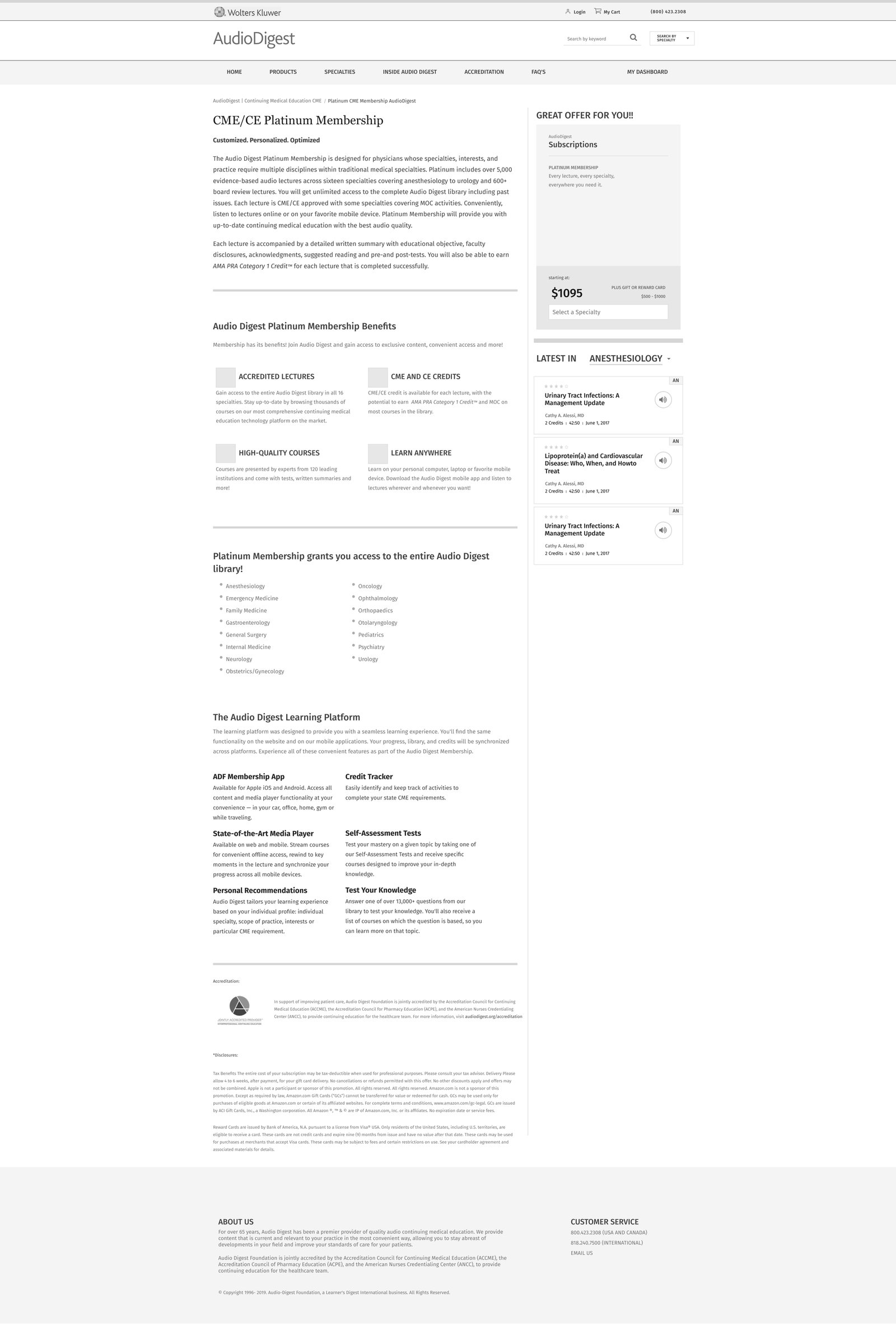
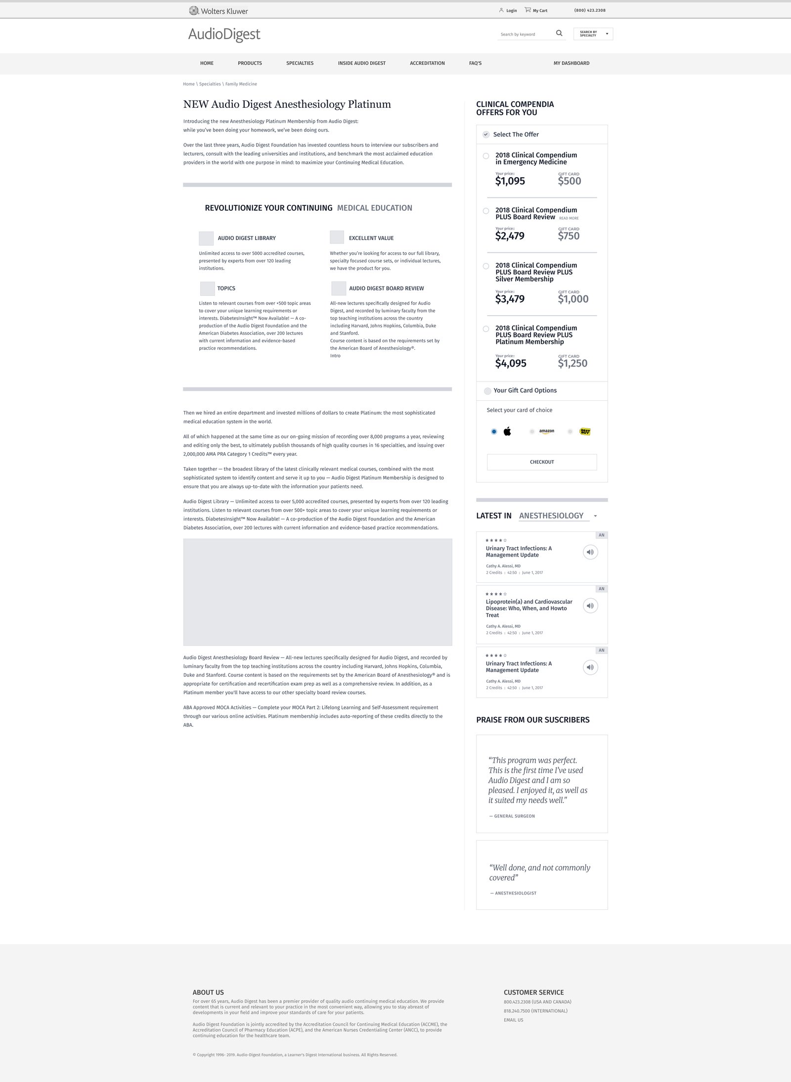
I wireframed key areas of the platform to set hierarchy, navigation, membership pathways and content discovery before applying visual design. Instead of treating each page separately, I looked for repeating structures that could become reusable components.
KEY DECISION
Build a Scalable Template. Maintain Design Consistency.
I created a reusable specialty page template that supported different medical specialties, allowing new content to be added without redesigning the page while maintaining a consistent user experience.
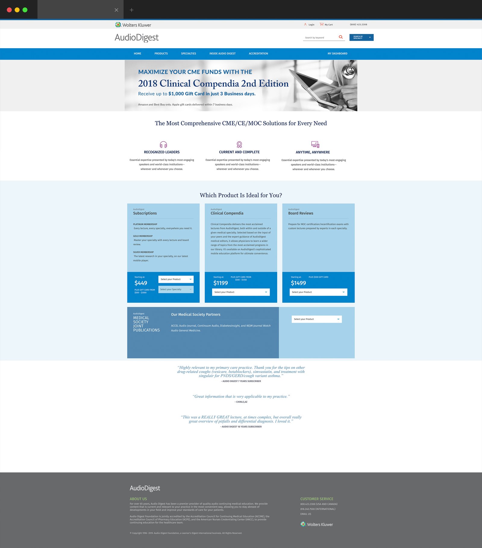
Homepage · Structuring the three-step finder and specialty panel before visual design.
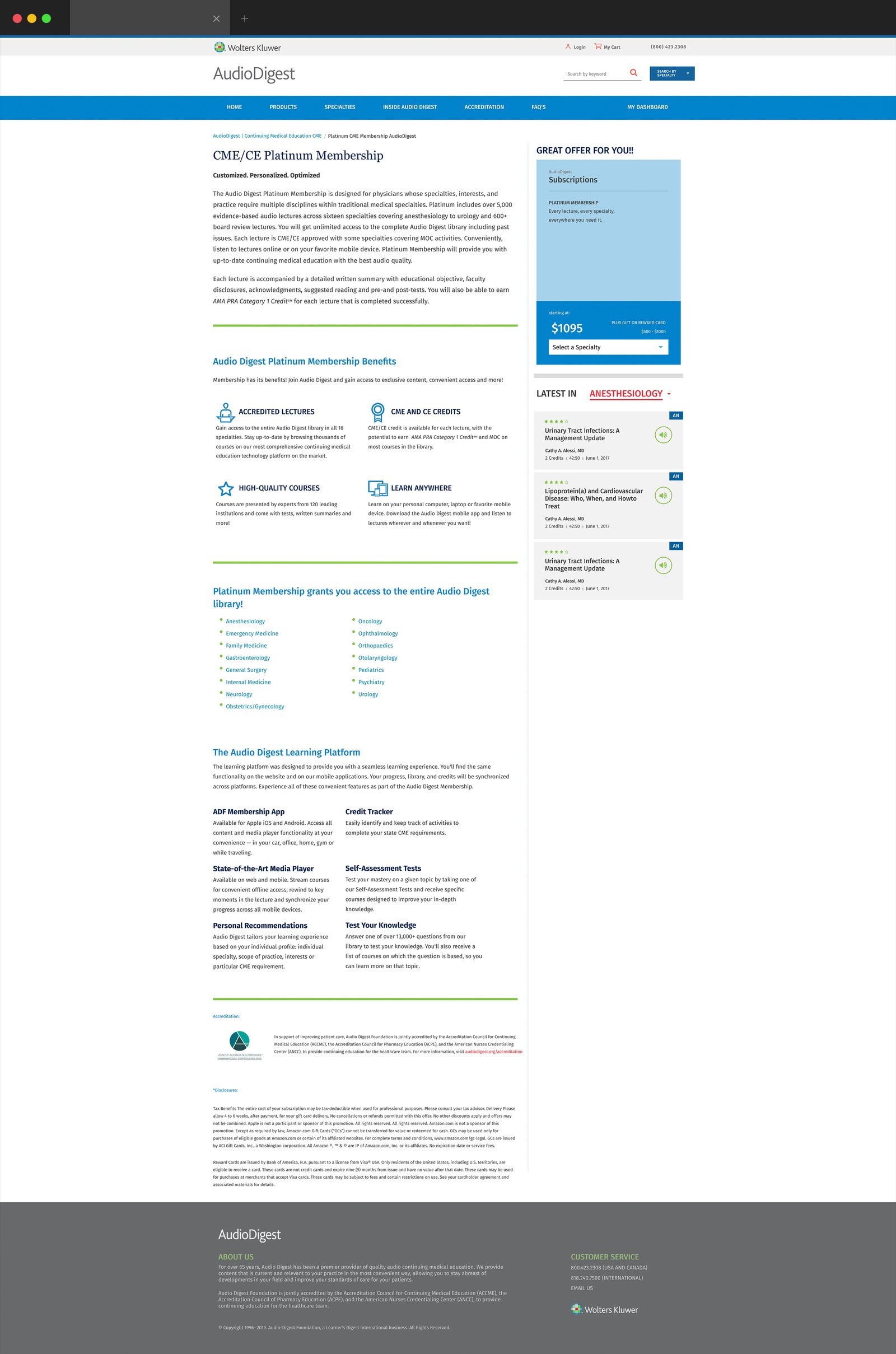
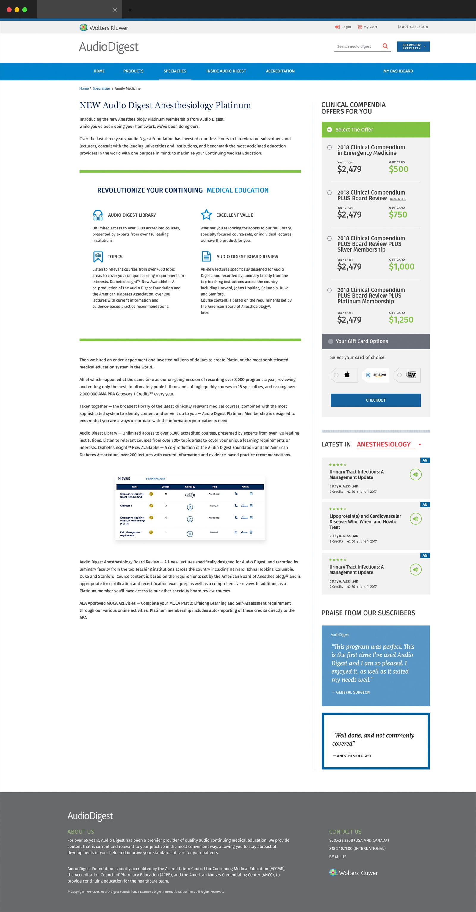
Platinum Membership · Plan details, benefits and purchase path in one consistent layout.
Specialty Platinum Page · The same membership template, tailored with specialty-specific content.
05 — DESIGN SYSTEM
Building a Scalable UI Foundation
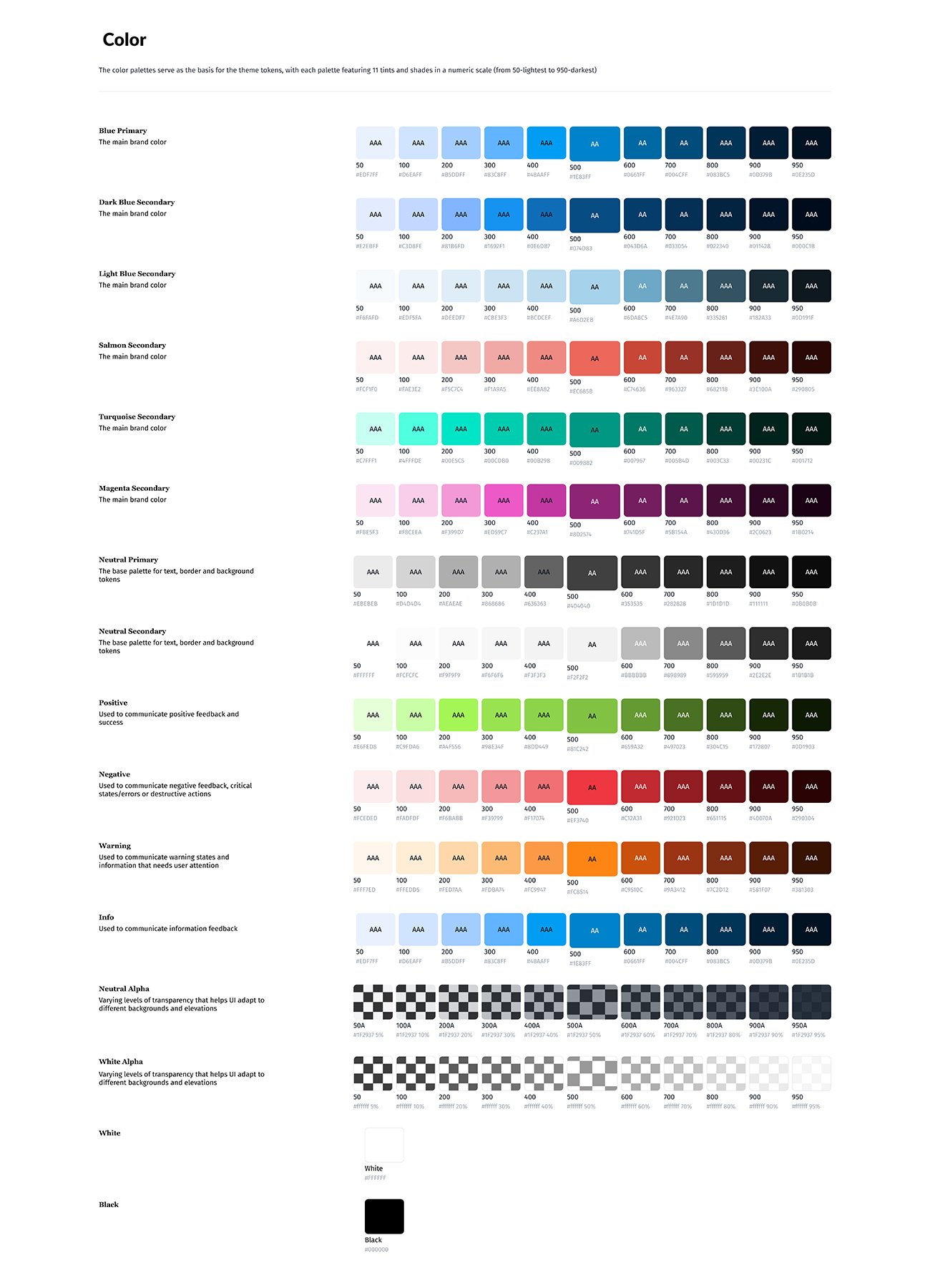
I built a design system that gave every membership, specialty, course, and commerce page the same visual language, and gave development one set of components to implement in Sitecore.
KEY DECISION
One Card System. Many Uses.
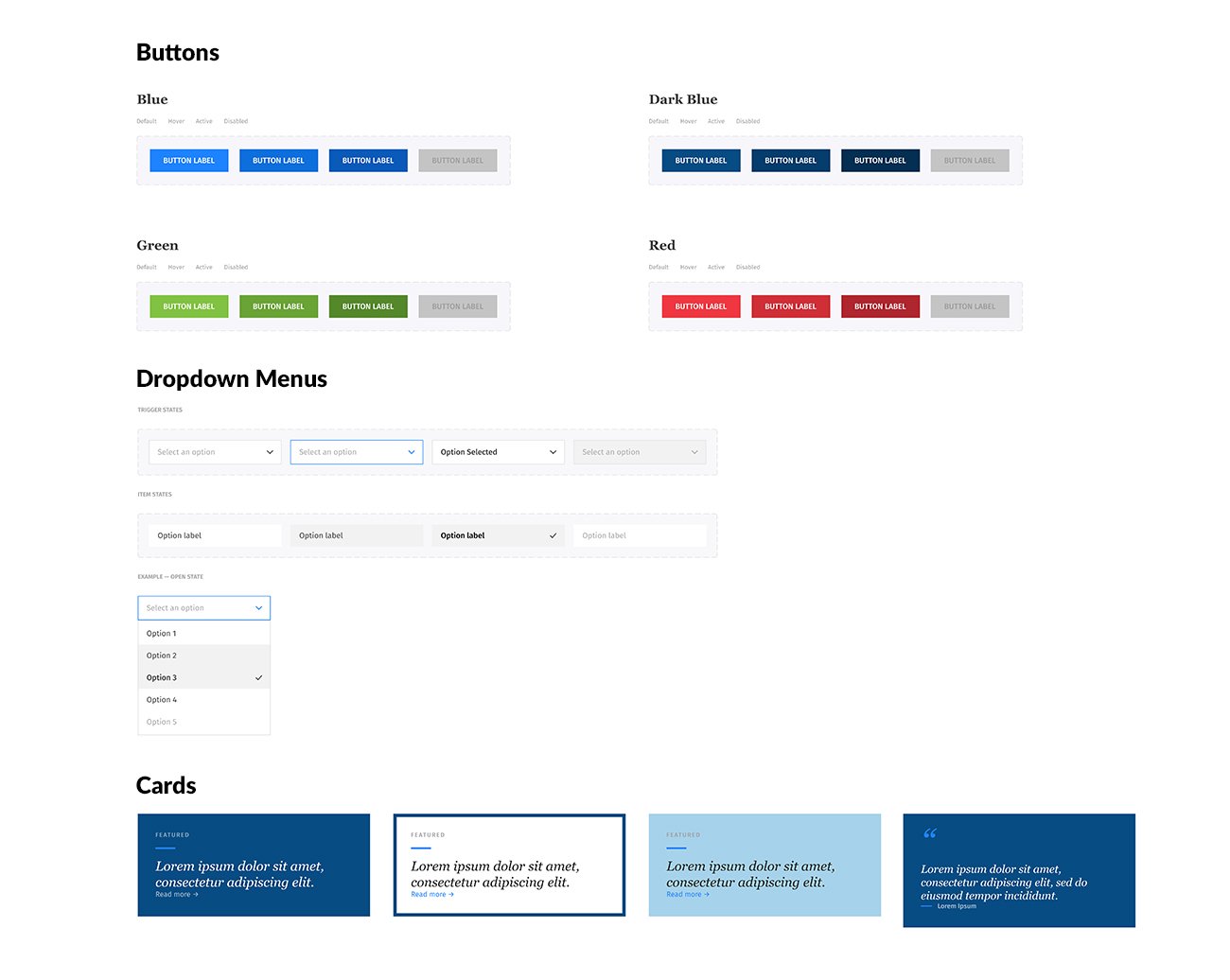
I designed one card family (featured, outline and quote variants) reused for promotions, collections and member testimonials across the site.
Color
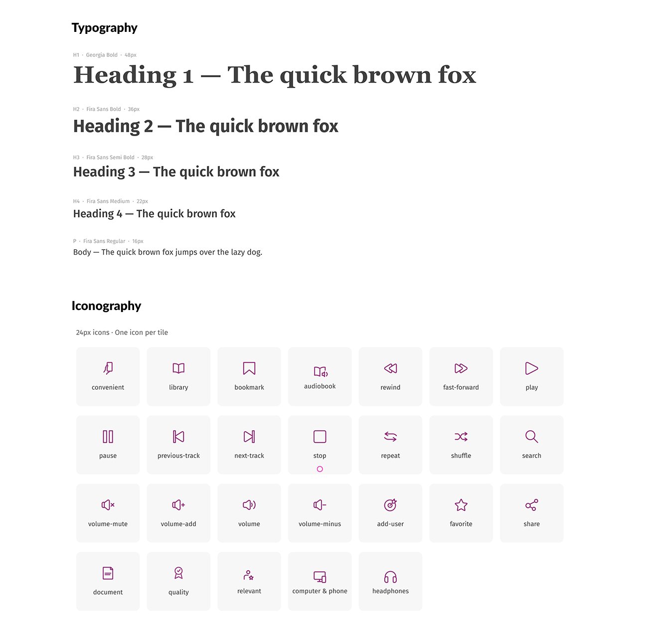
Typography
Dropdown Menus
Buttons
Quote Cards
Iconography
06 — SOLUTION
A Unified CME Experience
07 — SELECTED WORK
Audio Digest Experiences
EXPERIENCE 01 — HOMEPAGE
Guiding Physicians to the Right Product
KEY DECISION
One Question at a Time. Less Overwhelm.
I designed a three-step finder (Role, Specialty, Get Started) where each step unlocks after the one before it, so physicians answered one question at a time.
EXPERIENCE 02 — MEMBERSHIP
One Template, Every Specialty
KEY DECISION
Build Once. Tailor by Specialty.
I designed one membership template and built specialty versions in Sitecore, so an anesthesiologist saw anesthesiology lectures and credits instead of the generic catalog.
EXPERIENCE 03 — ADD TO CART
Choosing the Right Plan
KEY DECISION
Same Structure. Easy Comparison.
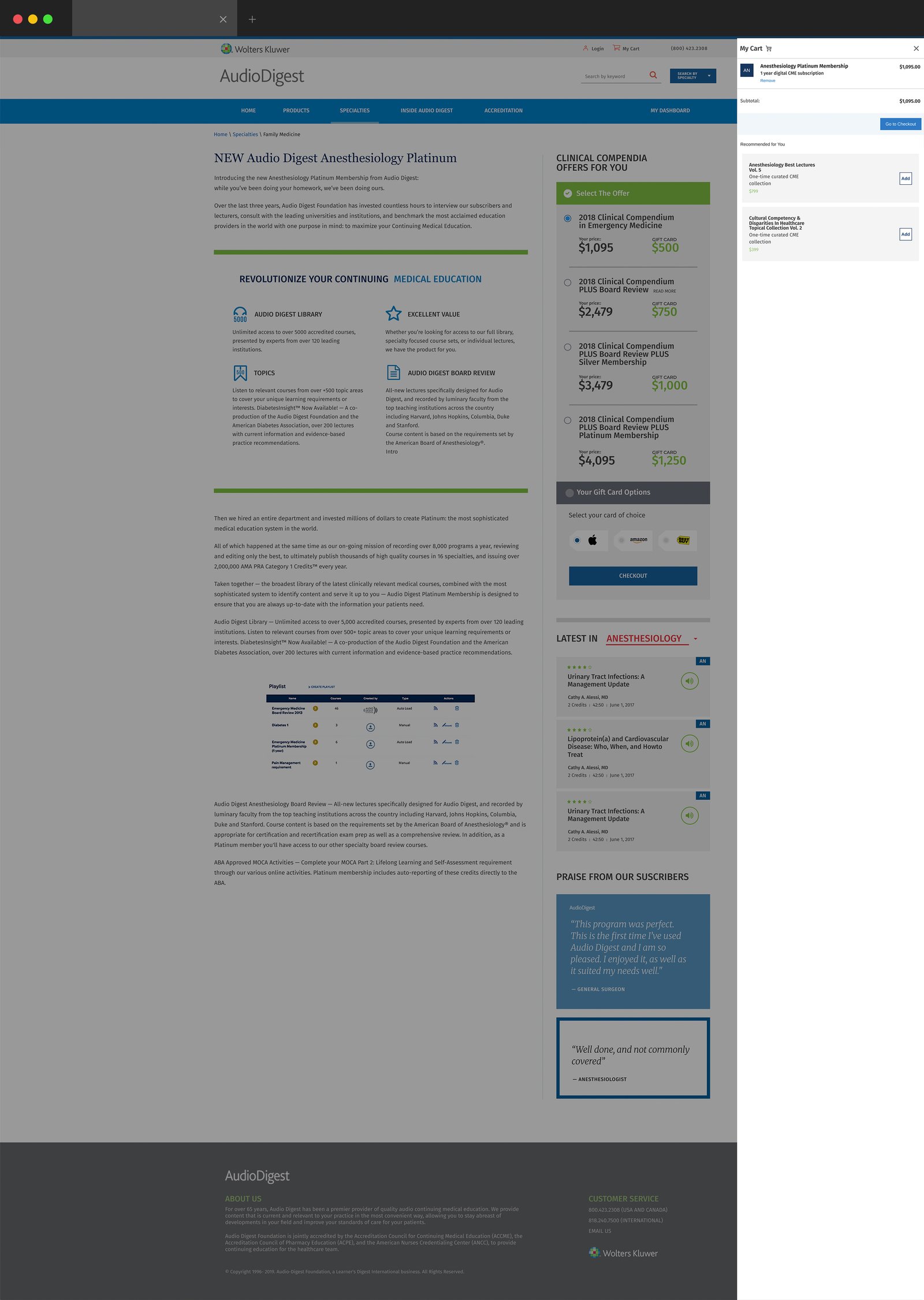
I gave each plan the same structure (plan, scope, price, benefits, Add to Cart) and kept Add to Cart inactive until a specialty was chosen, preventing incorrect orders.
EXPERIENCE 04 — CHECKOUT
A Clear Path to Purchase
KEY DECISION
Confirm Before Paying. Reduce Order Errors.
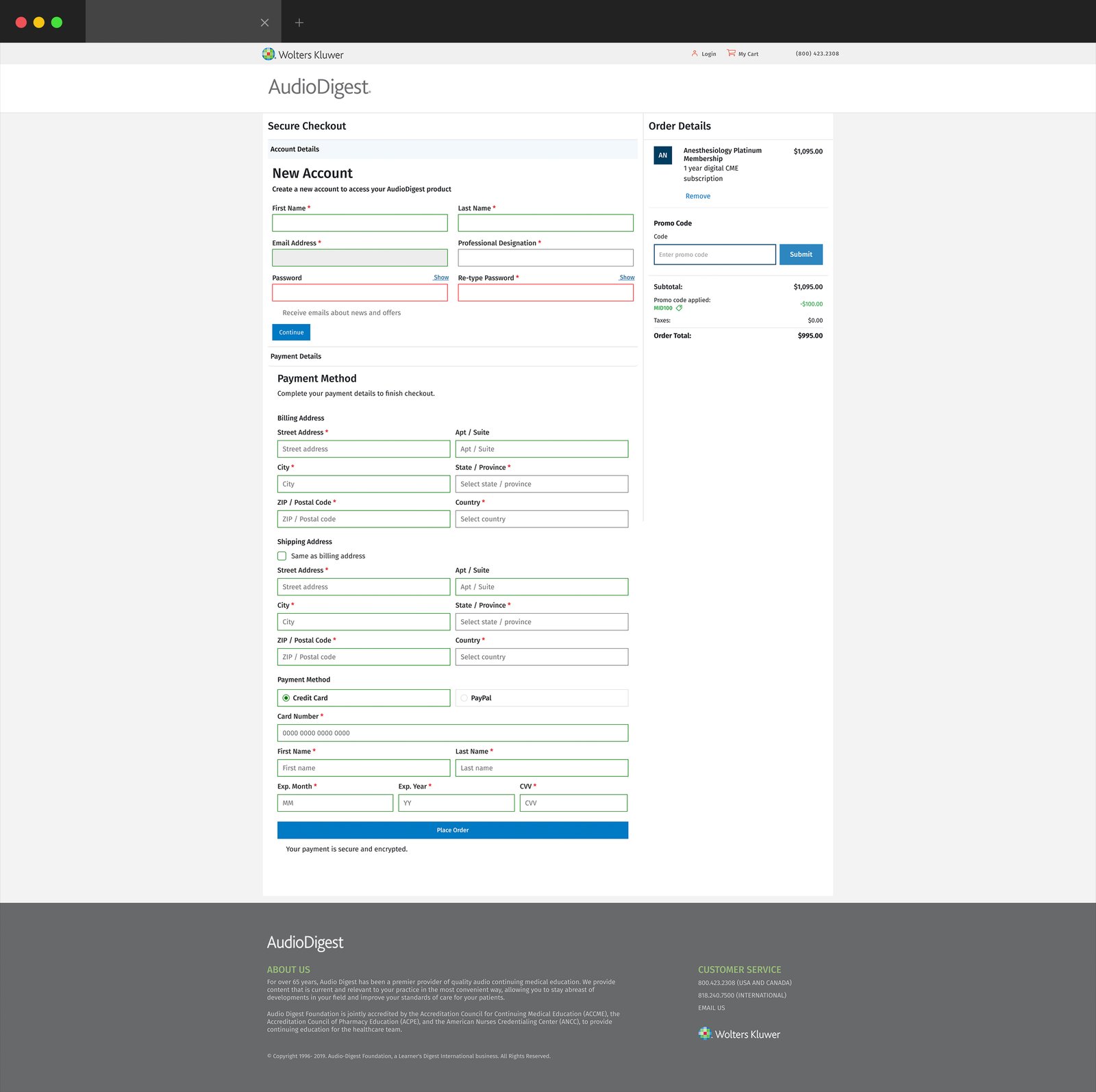
I kept an order summary beside the form, showing the plan, specialty, promo code and total, so physicians could confirm their order before paying. I split checkout into two steps, Account Details then Payment Details, and added a shipping address only for delivering the optional gift card.
08 — SCALE & DELIVERY
Built to Scale
90% Moved to Digital
4,000+ Catalog Items
29 Component Variants
Design to Sitecore
09 — REFLECTION
Key Learnings
Find the Repeating Pattern
Design for the People Who Maintain It
Building It Made Me a Better Designer
What I’d Do Next
Track how many visitors joined after viewing membership options, to see which layouts worked best.