CASE STUDY

Google Cloud

Enterprise UI/UX design for Google Cloud, simplifying complex technical content through scalable, responsive experiences.

Role Visual Designer
Timeline September—December 2017 • 4 Months
Company Google
Team Art Director, Project Manager, Full-Stack Developer, Copywriter, UI/UX Designer

01 - CONTEXT

Google Cloud

I worked on the Google Cloud website as part of a design team that included a Project Manager, Art Director and another Visual Designer. I owned the desktop experience, from wireframing through high-fidelity UI, while the other Visual Designer focused on tablet and mobile.

Using Google’s Material Design system, I created structured desktop experiences that organized complex technical and enterprise content while maintaining consistency with Google Cloud’s established visual language.

02 - CHALLENGE

Enterprise Complexity

Google Cloud serves audiences ranging from developers and IT professionals to enterprise decision-makers. The challenge was organizing technically dense product and service content into an experience that was easy to scan, understand and navigate.

The desktop layouts also needed to establish a strong structural foundation that could be adapted consistently across tablet and mobile.

03 - APPROACH

Structuring the Experience

I was responsible for the desktop UX and UI, taking page requirements from initial structure through production-ready design. My responsibilities included:
  • Created desktop wireframes
  • Established page structure and information hierarchy
  • Organized technical and enterprise content
  • Defined content sequencing and CTA placement
  • Designed high-fidelity desktop UI
  • Applied Google’s Material Design components and patterns
  • Defined typography, spacing and imagery
  • Collaborated with the tablet/mobile UX/UI Designer, Art Director and Project Manager

04 - SOLUTION

Clearer Product Pathways

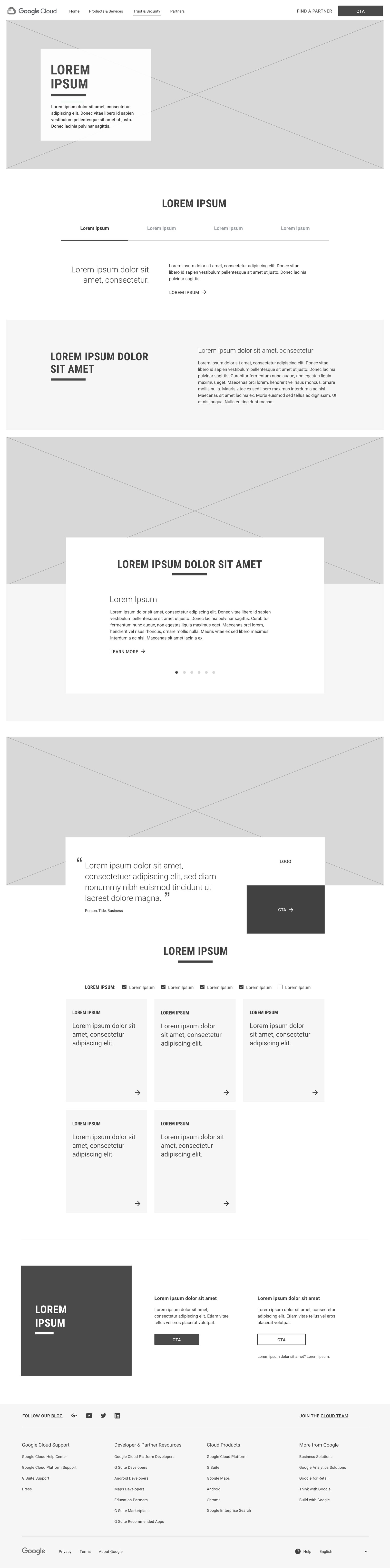
I began with desktop wireframes to establish information hierarchy, content sequencing, section relationships and user pathways before introducing visual styling.

Once the structure was defined, I translated the wireframes into high-fidelity UI using Google Cloud’s established Material Design components, colors, typography and visual patterns.

I collaborated with the Visual Designer responsible for tablet and mobile to ensure the hierarchy, components and content relationships translated consistently across breakpoints.
05 - SELECTED WORK

Google Cloud Experiences

Selected desktop experiences demonstrating information architecture, wireframing and high-fidelity UI design within Google Cloud’s established Material Design system.

EXPERIENCE 01 — DESKTOP WIREFRAMES

Establishing Structure Before Visual Design

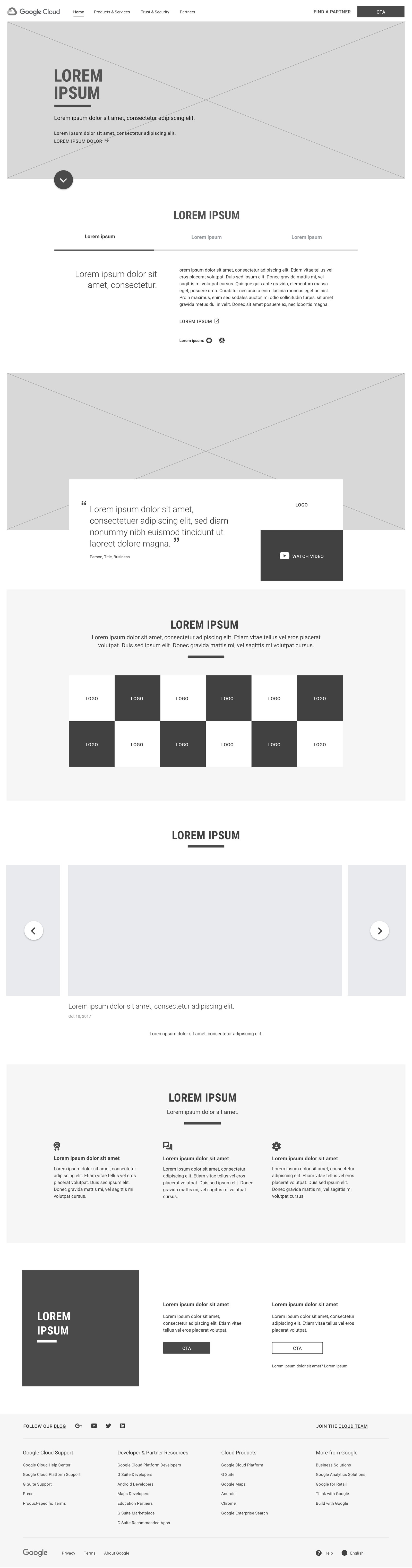
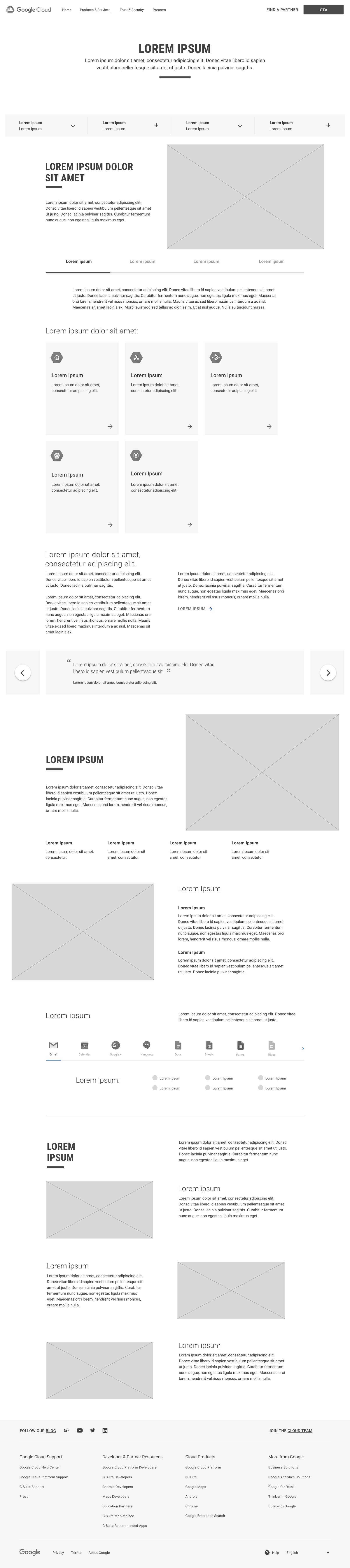
I used desktop wireframes to establish information hierarchy, content sequencing, section relationships and user pathways before moving into high-fidelity UI.

Working within the project requirements and Google Cloud’s established framework, I organized content into clear, scannable sections and defined the placement of key messaging, supporting information and calls to action. This created a structured foundation for the visual design while helping align the experience before production.

EXPERIENCE 02 — DESIGN REVIEW

Evaluating the Experience at Scale

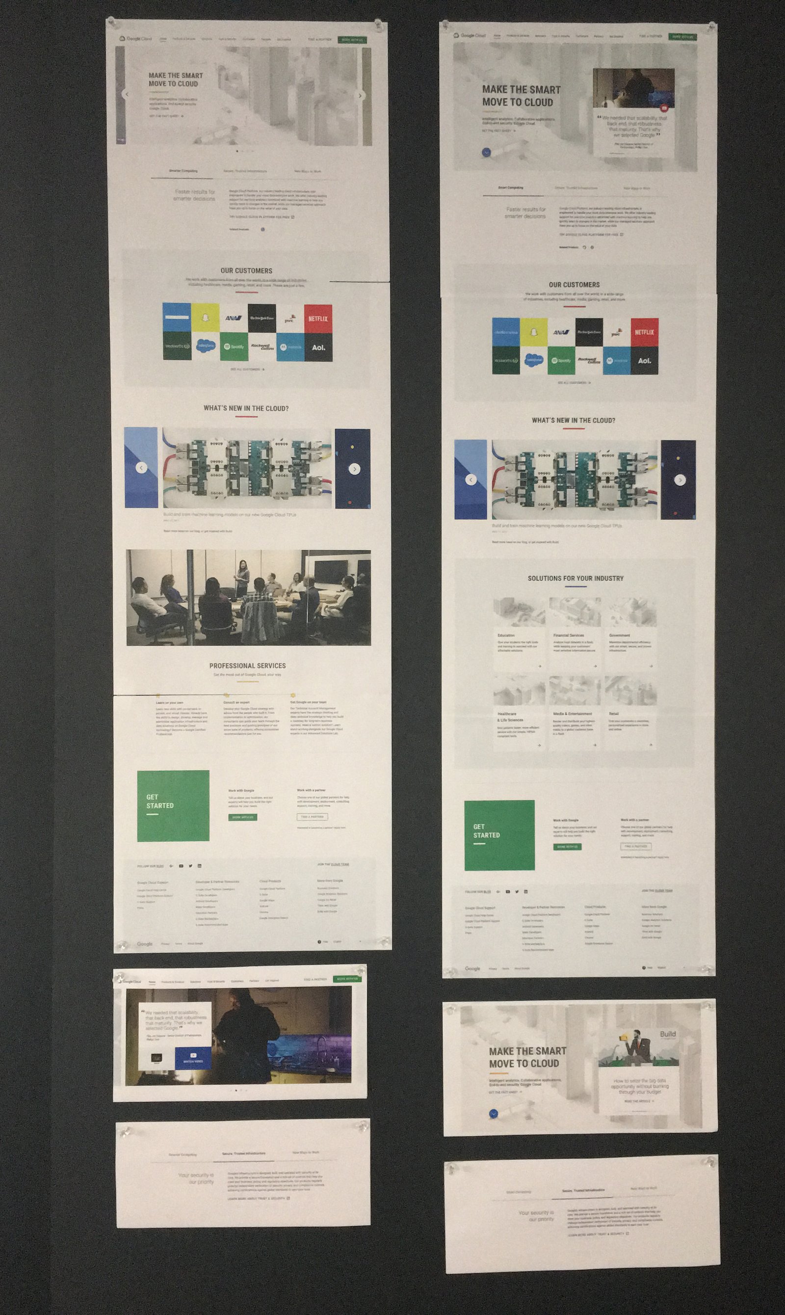
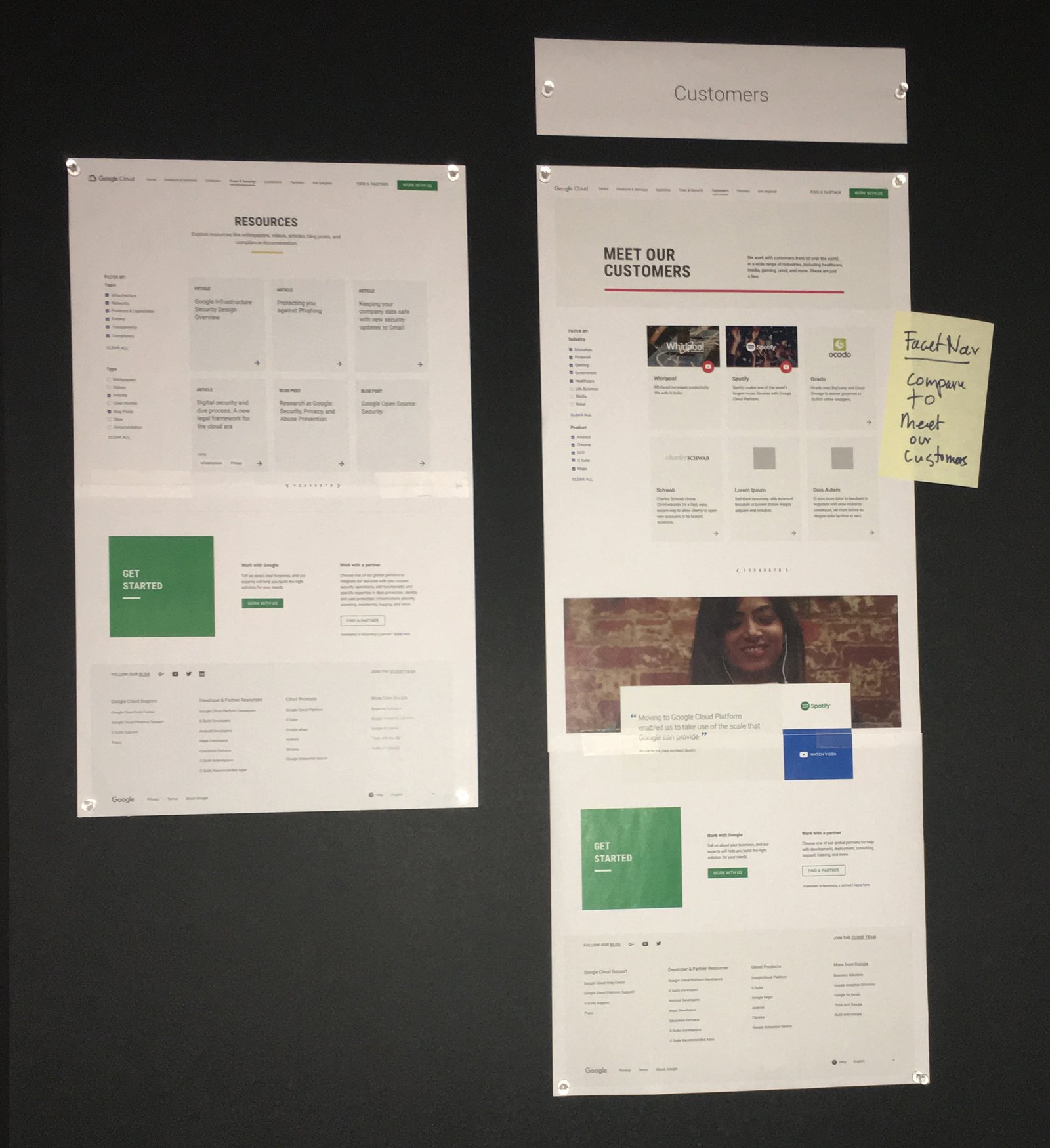
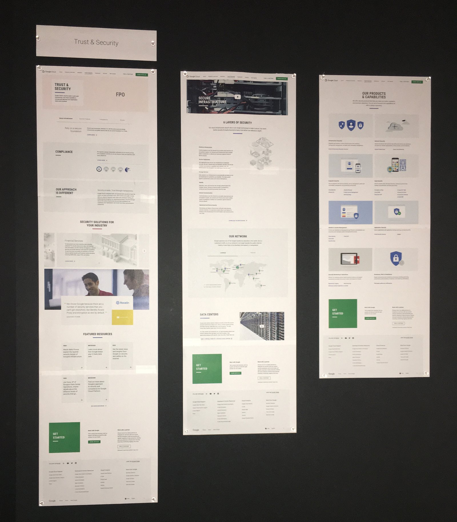
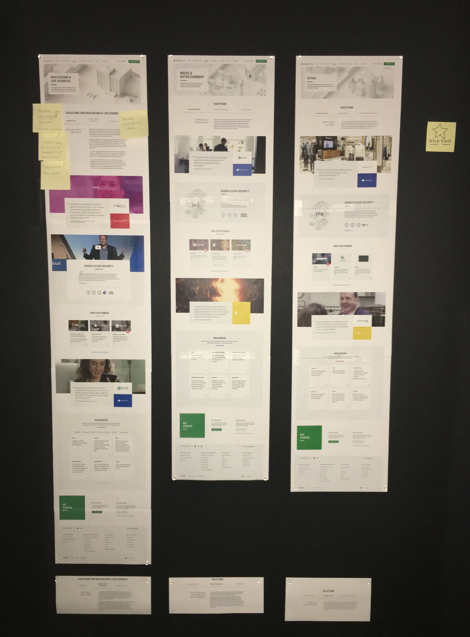
We printed the desktop UI pages at full scale and pinned them to review boards, allowing the team to evaluate page-to-page consistency, hierarchy, content flow and visual rhythm across the broader Google Cloud experience.

EXPERIENCE 03 — FINAL UI

Translating Structure Into Google Cloud UI

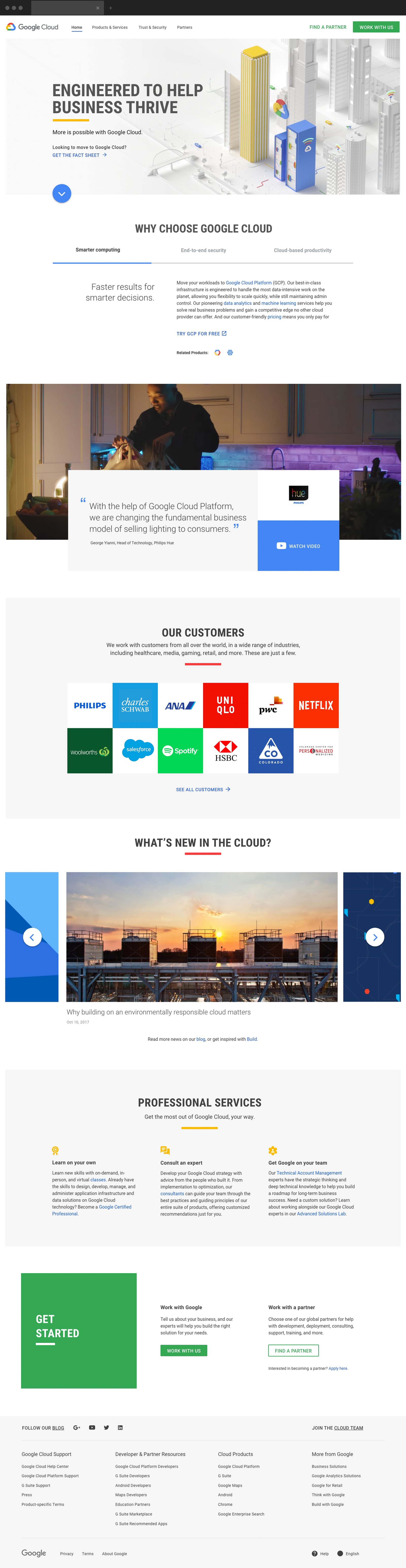
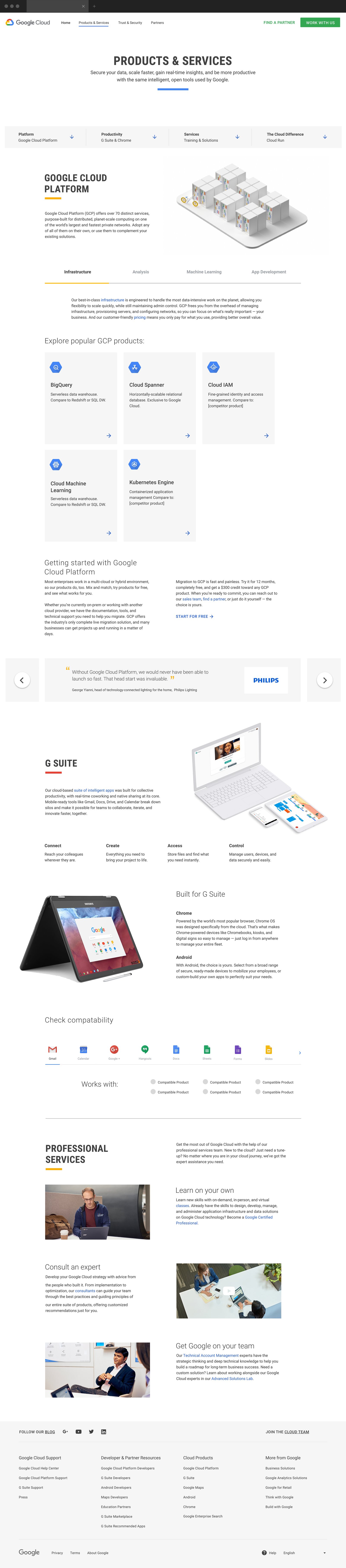
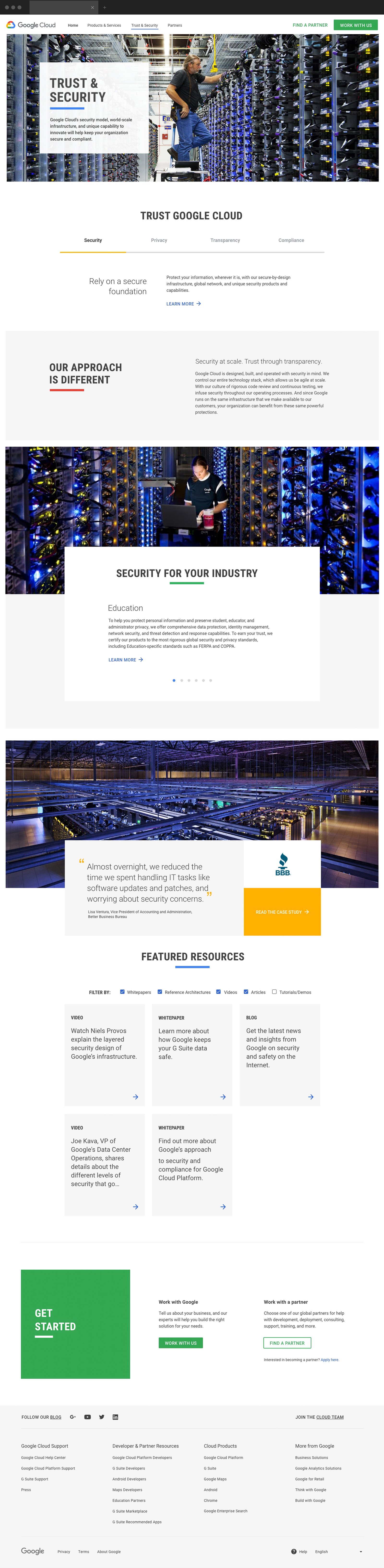
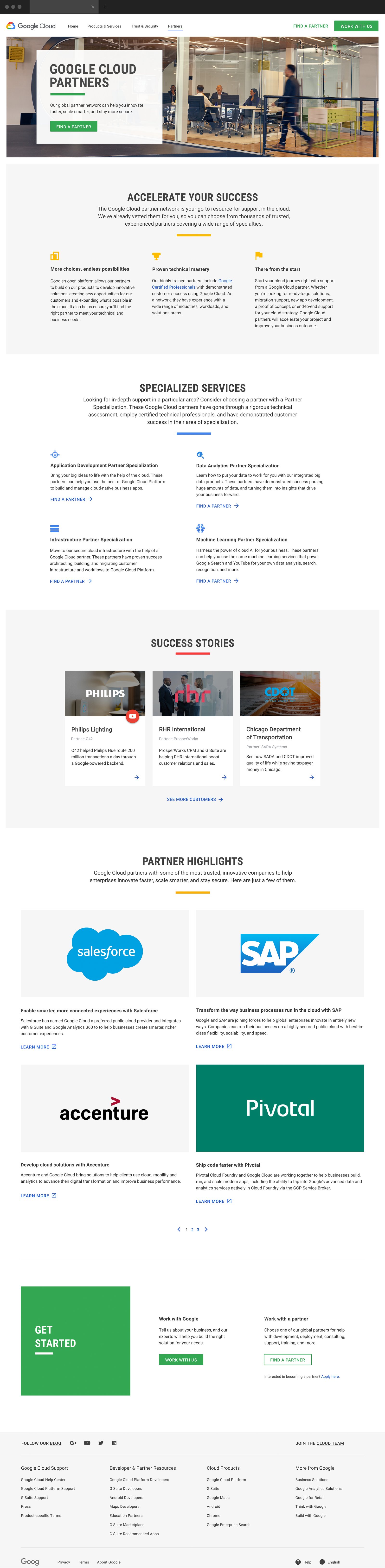
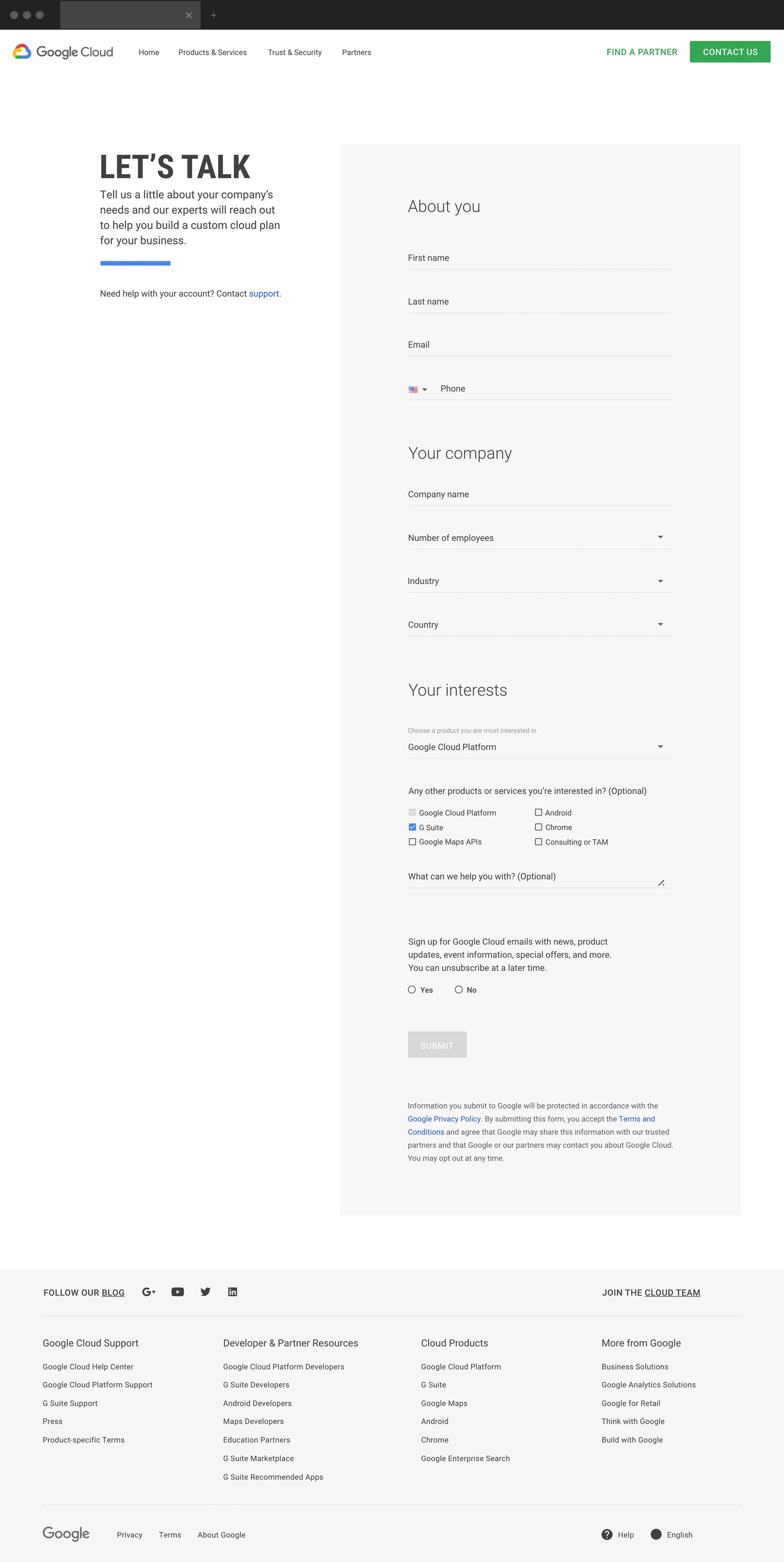
Once the desktop structure was established, I translated the approved wireframes into high-fidelity interfaces using Google Cloud’s Material Design system, established components, typography and visual language.

I refined spacing, hierarchy, imagery, component placement and calls to action to create polished desktop experiences that remained consistent with Google Cloud’s existing design standards while preserving the structure defined during wireframing.

06 - IMPACT

Designing at Global Scale

The work helped create a clearer, more structured Google Cloud desktop experience by organizing complex technical content into intuitive page layouts and consistent user pathways. The designs also established a strong foundation for responsive adaptation across tablet and mobile while maintaining alignment with Google’s Material Design system.

Annual Google Cloud Revenue
$ 0 B
Enterprises building with Gemini
0 +
Generative AI unicorns using Google Cloud
Nearly 0 %
Three-year ROI*
0 %

07 - REFLECTION

Key Learnings

Structure Before Visual Design

Establishing the desktop wireframes first created a clear foundation for content hierarchy, sequencing and page relationships before moving into high-fidelity UI.

Designing Within a Mature System

Working within Google Cloud’s established Material Design framework strengthened my ability to organize complex enterprise content while maintaining consistency with existing components and visual standards.

Cross-Designer Responsive Collaboration

Owning the desktop experience while collaborating with another designer on tablet and mobile reinforced the importance of alignment across breakpoints to maintain a cohesive responsive experience.

© 2026 Serj Khorozian — Made with ♥ in California.