CASE STUDY
Apple
Responsive UI and production design for Apple.com product launches across desktop, tablet and mobile.
01 - CONTEXT
Apple
02 - CHALLENGE
Precision at Every Breakpoint
03 - APPROACH
Responsive by Design
I translated approved copy, product imagery and campaign assets into responsive Apple.com page compositions. Working within established templates and design standards, I:
- Composed page layouts based on the provided content sequence
- Designed desktop, tablet and mobile variations
- Adjusted typography, spacing, alignment and section proportions
- Scaled, positioned and cropped imagery for each breakpoint
- Maintained visual consistency across product and campaign experiences
- Applied established Apple components and page patterns
- Prepared production-ready design files
- Sliced and exported optimized web assets
- Organized responsive asset variations for implementation
- Handed off final layouts and assets to developers
- Reviewed implementation details and addressed visual inconsistencies
My scope focused on responsive UI and visual design, production execution, asset preparation, developer handoff and implementation review within Apple’s established design system.
04 - SOLUTION
Consistency Across Devices
- Responsive content hierarchy
- Product imagery and visual composition
- Typography, spacing, and section rhythm
- Breakpoint-specific layout and asset adaptation
05 - SELECTED WORK
Apple.com Experiences
EXPERIENCE 01 — APPLE.COM HOMEPAGE
Adapting Apple’s homepage for changing product priorities
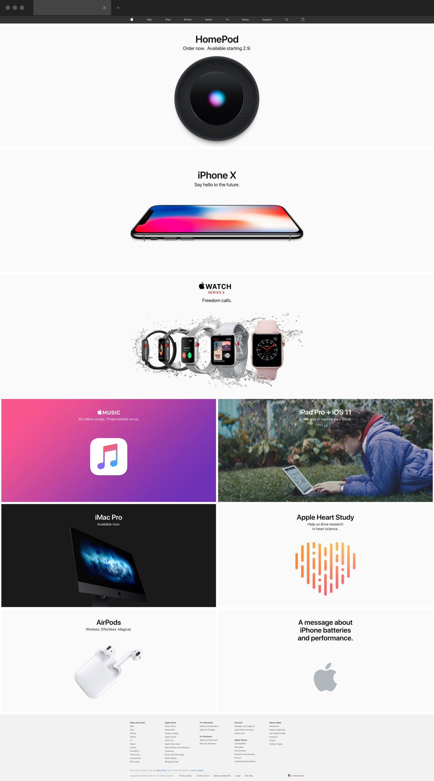
I designed responsive Apple.com homepage compositions supporting multiple product launches and promotional initiatives, including HomePod, iPhone X, iPhone 8, Apple Watch, iPad, iMac Pro, AirPods and Apple Music.
Using approved copy, imagery and content sequencing, I composed hero sections and promotional tiles while maintaining clear hierarchy, consistent spacing and strong product visibility across desktop, tablet and mobile.
EXPERIENCE 02 — HOMEPOD
Translating long-form product storytelling across devices
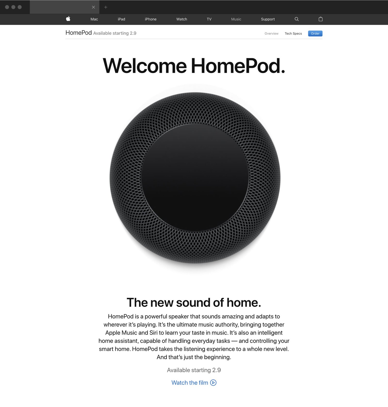
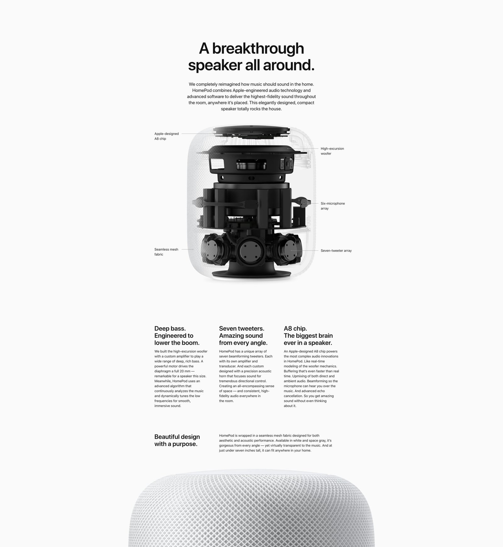
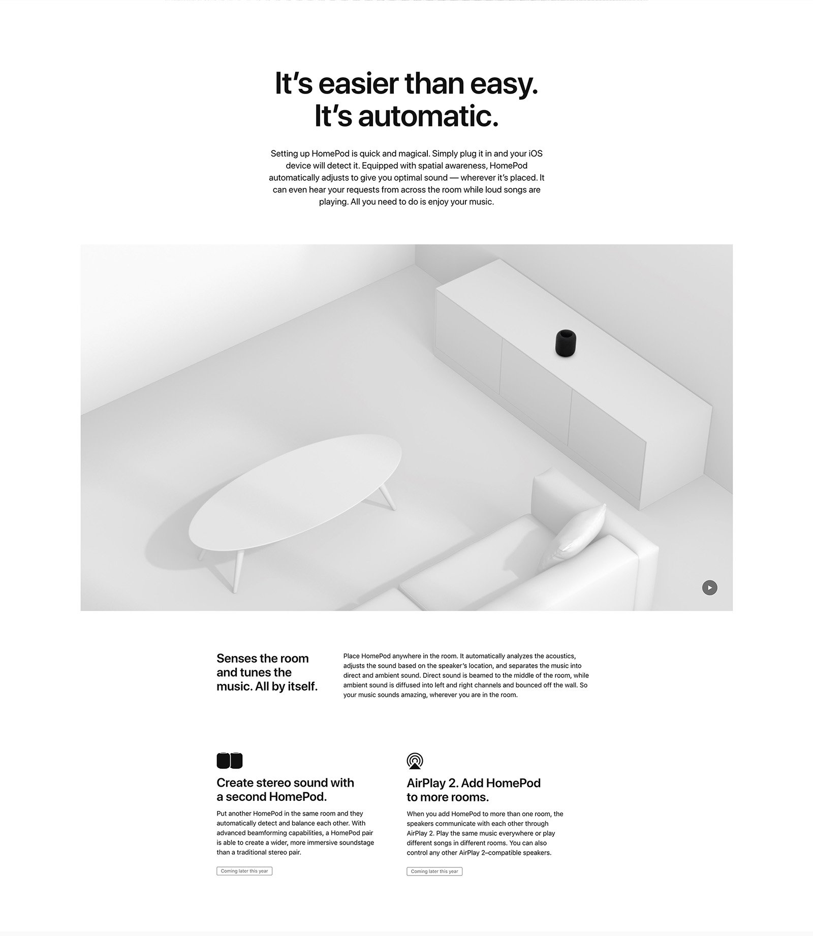
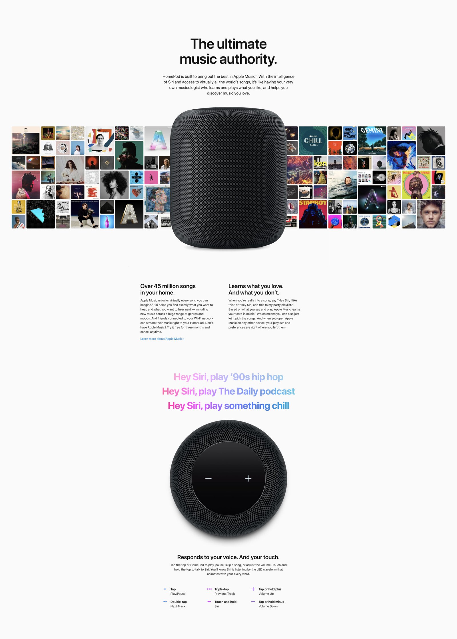
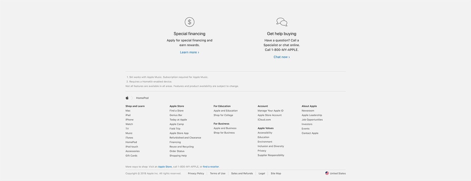
I designed responsive layouts for the HomePod product experience using approved copy, product imagery, technical illustrations and campaign assets.
Across desktop, tablet and mobile, I adapted typography, imagery, spacing, section proportions and content stacking to preserve the product narrative and visual impact at every breakpoint.
EXPERIENCE 03 — APPLE (PRODUCT)RED
Building a unified campaign and commerce experience
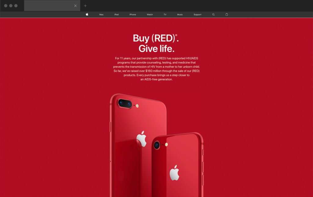
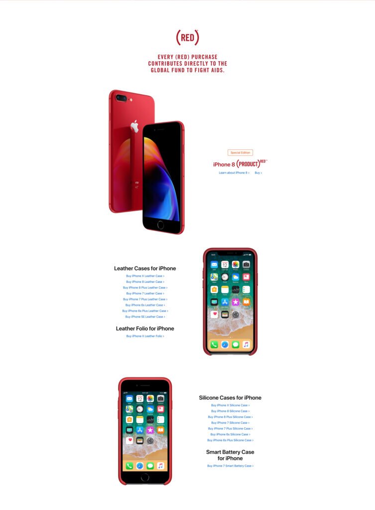
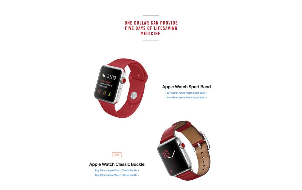
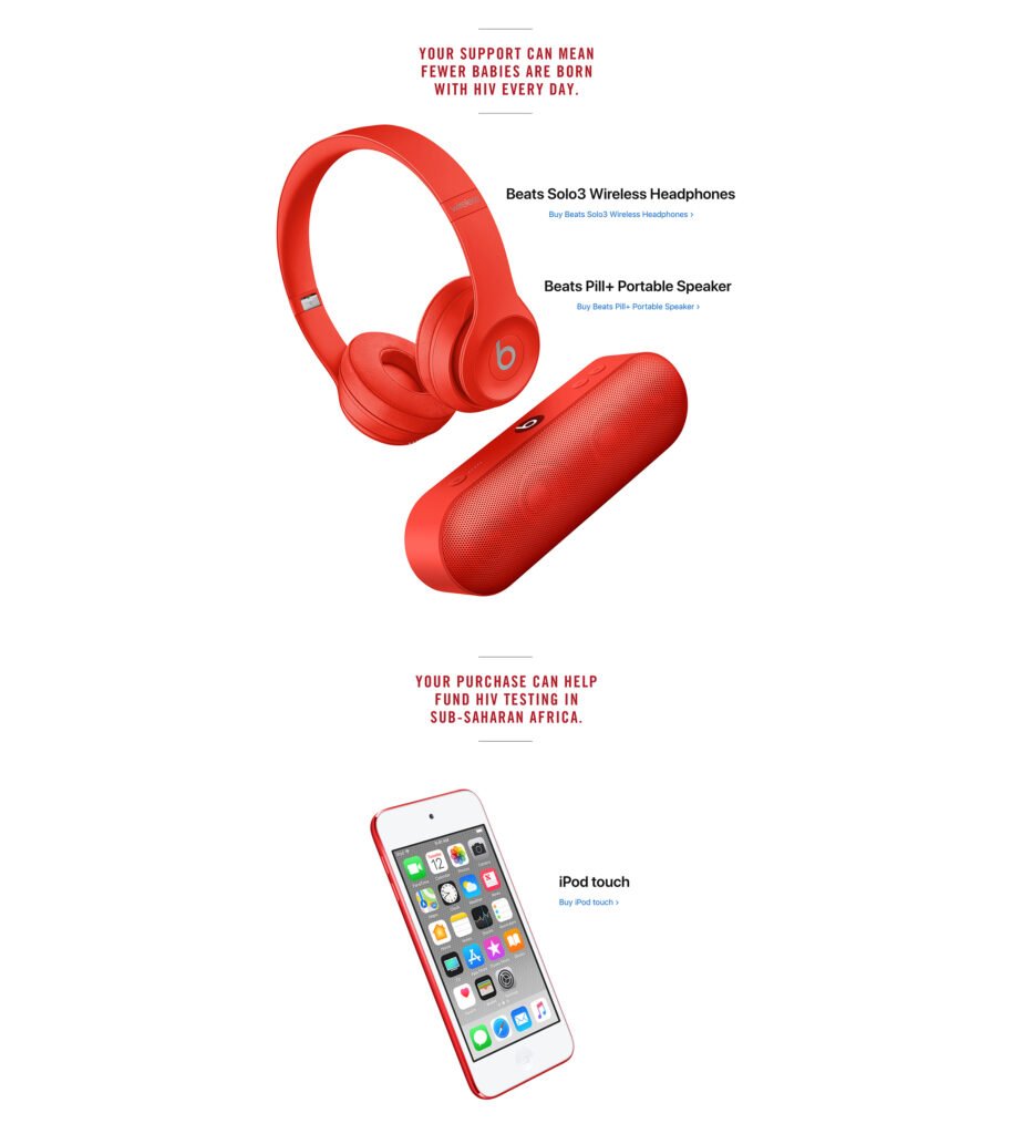
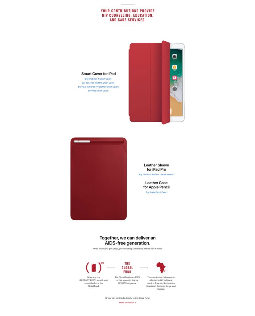
I designed responsive compositions for the Apple (PRODUCT)RED experience using approved campaign messaging, product imagery and accessory assets.
The experience brought together products across multiple Apple categories while maintaining a consistent visual rhythm between campaign storytelling, product imagery and commerce content.
06 - IMPACT
Launch & Campaign Scale
The work helped deliver cohesive, launch-ready Apple.com experiences across several high-profile products and campaigns. By translating approved creative materials into responsive page designs, I helped maintain consistency across changing homepage content, long-form product storytelling and campaign-focused commerce experiences. The responsive layouts preserved product visibility, visual hierarchy and brand quality across desktop, tablet and mobile. Preparing sliced, optimized and organized assets also supported a clearer and more efficient transition from approved design to development implementation.
07 - REFLECTION
Key Learnings
Designing Within an Established System
Precision Shapes the Experience
Small adjustments to image scale, typography, spacing, cropping and content stacking had a significant impact on clarity, hierarchy and overall polish.
Strong Handoff Supports Strong Execution
Preparing accurate, well-organized assets and staying closely aligned with development helped ensure the final implementation remained faithful to the approved design.